YAY GIMP WELL DONE... for a first its fine yeah mabey have a look at other pokemon boxes and use there styal a it more but YAY and well done dude!!!!!!!!!
#4 what text should i change it too?
#5 thats alot but i'll do it n e way i know about logo and i couldnt get the black box right either.
EDIT: update (white pixels gone and black box underneath 3+ gone)
thx guys real supportive (this is my 3rd box ever!)
i might do a box if 5 or more people ask..
Missing a Nintendo logo, Wi-fi is misplaced , pegi rating looks kinda weird (or is it just me?) , I can see the original background of that celebi (I think) and, don't put trainers on your box... Only if it's a really filled up box!
#11 about celebi thats a blur effect =P and the pegi is wierd because i didnt know where to cut it.
#thanks but can u tell what i should do to improve?
#13 i dont know what font to use though and as i said in #3 i dont want it to look too official
#14 aka me can ppl plz give rating and possibaly an idea 4 what to do next. (i only do nintendo btw)
 pokemon void Box Cover Comments
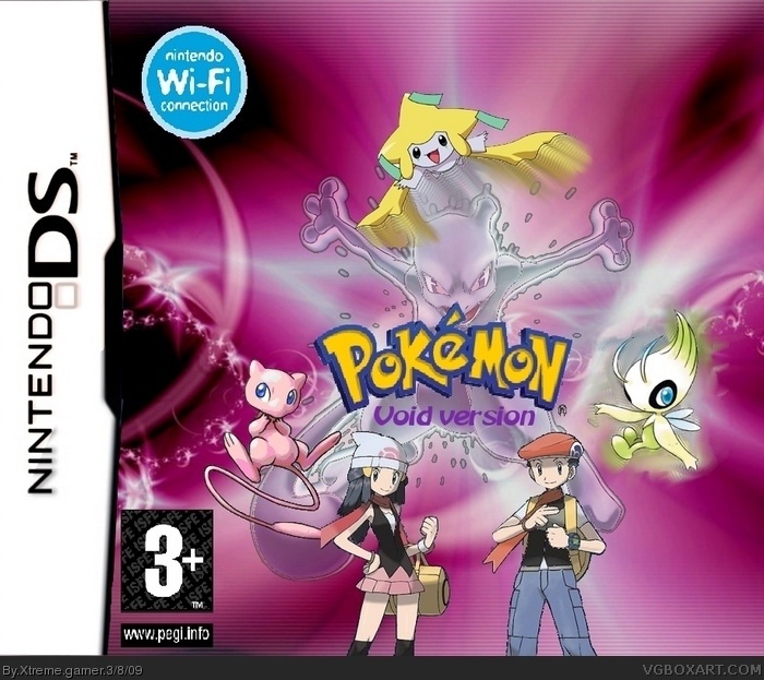
yay this is my first time using gimp and i know i havent got any divs on it yet but ill probably update it later.
[ Reply ]
YAY GIMP WELL DONE... for a first its fine yeah mabey have a look at other pokemon boxes and use there styal a it more but YAY and well done dude!!!!!!!!!
Edited at 1 decade ago
[ Reply ]
im adding in a bit more e.g. deoxys and darkrai faded in background.
the reason i didnt use the original stlye is bcoz i wanted to try sumat new
[ Reply ]
Well... quite interessting, but i dont like the script wich sais "void version", but the style is great. Fix that and ill fav.
[ Reply ]
My only gripes:
Renders have white pixels around them.
Black box under 3+.
Wi-Fi logo is bad.
Otherwise, it's nice, fix them and I'll favourite.
[ Reply ]
#4 what text should i change it too?
#5 thats alot but i'll do it n e way i know about logo and i couldnt get the black box right either.
EDIT: update (white pixels gone and black box underneath 3+ gone)
thx guys real supportive (this is my 3rd box ever!)
i might do a box if 5 or more people ask..
Edited at 1 decade ago
[ Reply ]
Oh, you're missing Nintendo logo. :P
[ Reply ]
i know but i think it needs the pokemon company one as well and i cant find any decent ones ill update it when i find some
(thx for the fav!)
[ Reply ]
void version.. you mean AVOID this box version?
[ Reply ]
no i dont. i mean darkness if you get my drift. and if ur not gunna be helpfull plz dont comment.
[ Reply ]
Missing a Nintendo logo, Wi-fi is misplaced , pegi rating looks kinda weird (or is it just me?) , I can see the original background of that celebi (I think) and, don't put trainers on your box... Only if it's a really filled up box!
[ Reply ]
Not bad for a first try on GIMP.
Just keep practicing and you will get it right!
[ Reply ]
#6, the text which sais "void version" does not look official, maybe try another font. the rest of the box is nice.
[ Reply ]
Very cool! +fav!
[ Reply ]
#11 about celebi thats a blur effect =P and the pegi is wierd because i didnt know where to cut it.
#thanks but can u tell what i should do to improve?
#13 i dont know what font to use though and as i said in #3 i dont want it to look too official
#14 aka me can ppl plz give rating and possibaly an idea 4 what to do next. (i only do nintendo btw)
[ Reply ]
#15, okay, the box is stylish, so 7.1/10 +fav ;)
[ Reply ]
#15 oops #14 posted first my bad
[ Reply ]
I like the background it goes very well with mewtwos character. it also looks like it would be fun to play on.
[ Reply ]
The WI-FI part is supposed to be in the corner above or below the Nintendo DS logo on the box.
Edited at 1 decade ago
[ Reply ]
oh my bad.
i cant be assed to fix it now
[ Reply ]