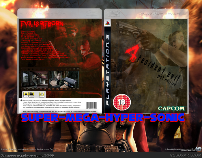
Pretty good, but the logo on the front is pretty hard to see, make it black or sepia and add a white glow to the edges and the back change the font and shorten the synopsis and the capcom logo on the front looks like its behind a layer, dont give it that type of effect, just add a sepia to it to make it look original, but the design youve got is good
 Resident Evil 4 Box Cover Comments
Sorry about choppy borders.
[ Reply ]
Pretty good, but the logo on the front is pretty hard to see, make it black or sepia and add a white glow to the edges and the back change the font and shorten the synopsis and the capcom logo on the front looks like its behind a layer, dont give it that type of effect, just add a sepia to it to make it look original, but the design youve got is good
[ Reply ]
Well done! It's very nice, but I agree with Roza!
[ Reply ]
Its good! Just change the description to a more readable font, but keep that tagline the font it is.
[ Reply ]
I cannot see the logo.
[ Reply ]
Too much description text, and the logo is barely visible.
There's too much overlay on the front and the characters are hardly visible as well.
I think you should work a bit more on this one.
[ Reply ]
The logo is hard too see, and the back is just a whole lot of text. It's not good.
5/10
[ Reply ]
What font for the back?
[ Reply ]
It'll make my box look like shit...
[ Reply ]
#9, Is that a compliment?
[ Reply ]
#10, yes...
[ Reply ]
!UPDATE!:D
Shotened description,diffrent font also Game logo and Capcom logo above the grunge layer.
[ Reply ]