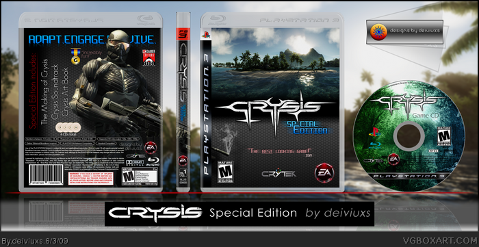
Worked hard on this one. Spend ~5 hours in making this box.
I tried to create something different and unique compared to other Crysis boxes.
All the images are from the game itself.
Please leave a comment and let me know what you think.
Also, if you liked this box, then please add it to favorites.
Thanks!
P.S. thanks Techne for PS3 template (excluding CD).
The design has a nice clean feel, and I can easily see you have some decent graphic arts abilities by looking at this box, but the front image is kind of throwing me off. Without sounding like I'm on a testosterone high, I think a Crysis design really needs some kind of guy with a large gun on the front. Technically, a very nice design though.
@ #5:
Screens on the back? I was thinking I don't need any screens since it's a Special Edition and most SE don't have screens on the back, because people know the game well.
@ #6:
The front was really were I was trying to add something different. When people talk about Crysis, they say that the game has amazing graphics and I wanted to add a nature scene which would show that.
I might add v2 with a guy in front (either with or w/out the scenery).
Regarding the front, I think you did good with the nature scene, however, In my opinion the scenery should be below the logo, and the soldier should be on the top of the logo. The soldier's gun is somewhat in the front as well, which is weird because unless you turn it around you wouldn't know what that is.
On the back, I like the cleanness of it, but I think the solider is covering too much of the tag-line. That's a big no-no, since we want the tag line to snag the game's audience. As for the text sideways it seems functional but when you think about it, you really wouldn't want to turn a box to read it's contents... I think it'd be very possible to fade some snapshots in there if nothing else, and to re-arrange the text in a traditional format.
Very good box, but just a few functionality errors. I'd rate this highly though because of the effort I can clearly see you put into it.
That's it...only 3 favs. :( My Crysis Portable box has more favs, which took me 5 times less time to create than this box. It just doesn't make sense..
Unfortunately, I am not able to edit this box because I lost the .psd file.
Anyways, thanks for comments, I will keep the critiques in mind for the future boxes.
I like the style. Looks good for a SE box. Don't like how the text on the back is covered by the soldier. Front looks pretty good, I like how you placed the logo in the middle of the fade of the separation. The disc looks awesome too. Nice Job.
 Crysis Box Cover Comments
Worked hard on this one. Spend ~5 hours in making this box.
I tried to create something different and unique compared to other Crysis boxes.
All the images are from the game itself.
Please leave a comment and let me know what you think.
Also, if you liked this box, then please add it to favorites.
Thanks!
P.S. thanks Techne for PS3 template (excluding CD).
Edited at 1 decade ago
[ Reply ]
bump...I worked so hard on this and nothing.. :(
[ Reply ]
this is really cool!
+fav
[ Reply ]
finally! I was starting to think that my box is invisible.
[ Reply ]
Try adding some screens.
[ Reply ]
The design has a nice clean feel, and I can easily see you have some decent graphic arts abilities by looking at this box, but the front image is kind of throwing me off. Without sounding like I'm on a testosterone high, I think a Crysis design really needs some kind of guy with a large gun on the front. Technically, a very nice design though.
[ Reply ]
@ #5:
Screens on the back? I was thinking I don't need any screens since it's a Special Edition and most SE don't have screens on the back, because people know the game well.
@ #6:
The front was really were I was trying to add something different. When people talk about Crysis, they say that the game has amazing graphics and I wanted to add a nature scene which would show that.
I might add v2 with a guy in front (either with or w/out the scenery).
Thanks for comments and keep them coming!
P.S. if you liked the box, then please fav.
Edited at 1 decade ago
[ Reply ]
Regarding the front, I think you did good with the nature scene, however, In my opinion the scenery should be below the logo, and the soldier should be on the top of the logo. The soldier's gun is somewhat in the front as well, which is weird because unless you turn it around you wouldn't know what that is.
On the back, I like the cleanness of it, but I think the solider is covering too much of the tag-line. That's a big no-no, since we want the tag line to snag the game's audience. As for the text sideways it seems functional but when you think about it, you really wouldn't want to turn a box to read it's contents... I think it'd be very possible to fade some snapshots in there if nothing else, and to re-arrange the text in a traditional format.
Very good box, but just a few functionality errors. I'd rate this highly though because of the effort I can clearly see you put into it.
[ Reply ]
Thanks for your comment and criticisms Ray Blade! I will keep in mind them and reflect them on v2.
[ Reply ]
nice
[ Reply ]
DOUBLE POST
Edited at 1 decade ago
[ Reply ]
That's it...only 3 favs. :( My Crysis Portable box has more favs, which took me 5 times less time to create than this box. It just doesn't make sense..
[ Reply ]
Unfortunately, I am not able to edit this box because I lost the .psd file.
Anyways, thanks for comments, I will keep the critiques in mind for the future boxes.
[ Reply ]
UPDATE:
Small changes to the presentation.
[ Reply ]
wowo this needs more attention. love the logo and the whole box in general.
+fav
+author fav
[ Reply ]
Thank you for favs+ GrahamZ! =)
[ Reply ]
Nice-eys
+fav
[ Reply ]
A very sleek design, nice a put together very well. I like it.
[ Reply ]
Awesome I like the approach you took with this.
Edited at 1 decade ago
[ Reply ]
I like the style. Looks good for a SE box. Don't like how the text on the back is covered by the soldier. Front looks pretty good, I like how you placed the logo in the middle of the fade of the separation. The disc looks awesome too. Nice Job.
[ Reply ]
I like the design, would be better with some screens on the back and maybe a picture more relevant to the game on the front cover. fav
[ Reply ]
i like the idea, have to say it's alot better then anything i can create, i like it.
+Fav
[ Reply ]
I kinda like it. The back sucks, but the front does a good job of showing that the game is a graphics powerhouse.
[ Reply ]