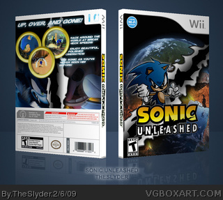
Trying an older style of presentation here. More simplistic. I hate that it's so low resolution, but I was using Imandix to get the template, and for whatever reason it came out lower than I expected and didn't realize until it was too late.
Some of you may have seen this in my WIP thread. I'm glad that I was able to finish but overall I think I'm pretty disappointed with the result. The drawing is far too sketchy, even for stylization, and I hate that the images on the back is inconsistent with my drawing. Still, though. I'm pleased that I finished it.
As always, check out the printable version for a high detailed look.
#3, You're a dick if you're going to state that you don't like shit without explaining why.
The thumbs down is a "face off" pose. It's to be assumed that he's threatening someone and thus giving them a thumbs down as a way of saying that they're SOL.
#5«#3.Thats not really needed, he said himself that he coulve done better but it just didnt come out right and you just say you dont like it, you could have have atleast give constructive critisism. So what if it's Sonic, is that against the rules...'thumbs down' is not the right way to state it. You then said it wasnt good without giving a damn explanation, he posted the box less than one hour before you said 'nobody faved it'. Maybe you but not everyone stays on VGBA 24/7.
Iam from Germany,and so ive another time here,sorry^^...
And whats with #2,is that a constructive critism????NOOOO...he said only he liked it,and so i can say i dont like it!
#7 constructive CRITISISM! Not constructive likes, you point out what you don't like you don't just go I don't like it. Also try and learn to use grammer, how old are you?
The artwork has a nice loose flow to it Sylder, I think it looks pretty cool actually. The look of it reminds me a bit of the animated intro from Sonic CD.
The hand drawn rip effect looks pretty good as well, and I can tell you went into the drawing with the box design in mind. The back kind of clashes with the front as you've mentioned, but not so much that it takes away from your custom art.
 Sonic Unleashed Box Cover Comments
Trying an older style of presentation here. More simplistic. I hate that it's so low resolution, but I was using Imandix to get the template, and for whatever reason it came out lower than I expected and didn't realize until it was too late.
Some of you may have seen this in my WIP thread. I'm glad that I was able to finish but overall I think I'm pretty disappointed with the result. The drawing is far too sketchy, even for stylization, and I hate that the images on the back is inconsistent with my drawing. Still, though. I'm pleased that I finished it.
As always, check out the printable version for a high detailed look.
[ Reply ]
#1, Lol, you pointed the things out I didn't like! :P
Nice job!
[ Reply ]
Dont like the back,dont like the front...
ANd why sonuc thumbs down?????
2/5
[ Reply ]
#3, You're a dick if you're going to state that you don't like shit without explaining why.
The thumbs down is a "face off" pose. It's to be assumed that he's threatening someone and thus giving them a thumbs down as a way of saying that they're SOL.
[ Reply ]
I'm what?A Dick? *LOL*
Stay cool,the box isnt rellay good,nobody faved it...okayyyy????
xD
[ Reply ]
#5«#3.Thats not really needed, he said himself that he coulve done better but it just didnt come out right and you just say you dont like it, you could have have atleast give constructive critisism. So what if it's Sonic, is that against the rules...'thumbs down' is not the right way to state it. You then said it wasnt good without giving a damn explanation, he posted the box less than one hour before you said 'nobody faved it'. Maybe you but not everyone stays on VGBA 24/7.
[ Reply ]
Iam from Germany,and so ive another time here,sorry^^...
And whats with #2,is that a constructive critism????NOOOO...he said only he liked it,and so i can say i dont like it!
[ Reply ]
#7 constructive CRITISISM! Not constructive likes, you point out what you don't like you don't just go I don't like it. Also try and learn to use grammer, how old are you?
[ Reply ]
#8, germany...
[ Reply ]
The artwork has a nice loose flow to it Sylder, I think it looks pretty cool actually. The look of it reminds me a bit of the animated intro from Sonic CD.
The hand drawn rip effect looks pretty good as well, and I can tell you went into the drawing with the box design in mind. The back kind of clashes with the front as you've mentioned, but not so much that it takes away from your custom art.
[ Reply ]
lol Horrible night stages.
[ Reply ]