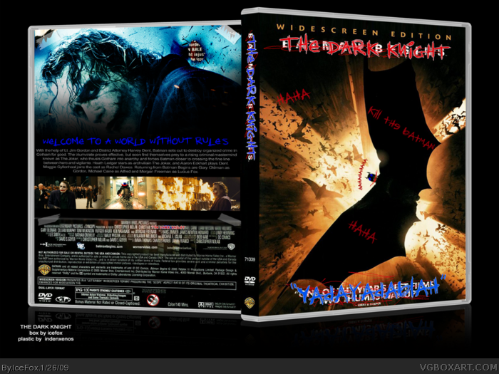
7. Perhaps. The basic idea for the back was to have had the Joker just paste his own image over it (see tape, tears, and holes). Using the official back to keep the theme would have just made a mess (see official Begins packaging) which is why I only kept small snippets of it.
Printable being added. I suggest you view this as well - bigger + higher quality.
 The Dark Knight Box Cover Comments
Nice!
[ Reply ]
Ignore versions 1 & 2 (unless you want to see the differences). V3 is of course the final.
I have been wanting to make a Dark Knight box for a while. I decided to do the Joker graffiti style but make it a little bit different.
The end result is very meh, IMO, but I uploaded it as I am sure someone (edit: ie ChuckECheese123 =p) may like it.
Edit Edit: I lied. Version 4 is the final one. God, next time I am going to make sure it's done before I upload.
Edited at 1 decade ago
[ Reply ]
good but i think theres been a few done like this
[ Reply ]
3 - the idea was to use the idea and apply it to Batman Begins.
Edit: FINAL VERSION UPLOADED
Edit Edit: I lied. Version 4 is the final one. God, next time I am going to make sure it's done before I upload.
Edited at 1 decade ago
[ Reply ]
so is it a batman begins boxart or darknight boxart
[ Reply ]
5, The Dark Knight
[ Reply ]
oh ok sorry bout that..ummm you should add some more graffit like on the back just so you can keep with that whole theme you know what i mean
[ Reply ]
7. Perhaps. The basic idea for the back was to have had the Joker just paste his own image over it (see tape, tears, and holes). Using the official back to keep the theme would have just made a mess (see official Begins packaging) which is why I only kept small snippets of it.
Printable being added. I suggest you view this as well - bigger + higher quality.
[ Reply ]
oh now i see i couldnt see that at first i thought you just altered the front of the original cover...lol
[ Reply ]
I lied.
Version 4 uploaded - this is really the last one, honest to George.
I had to fix the dimensions it was stretched horizontally.
[ Reply ]