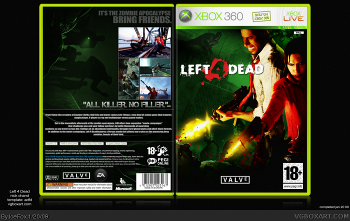
As Drakxxx says, the front is great.. not seen that image before. The layout of the screenshots are cool... although I thinks it looks very empty on the left side even with that green image. Maybe if you had text constructed like the screenshots on there, it would have compliment it :) Nice work.
 Left 4 Dead Box Cover Comments
Full view please and enjoy :)
And please check my other boxes especially this one (comment if you can!):
link!/?replies=11
[ Reply ]
Ooh Nice!
[ Reply ]
The left side of the back seems empty.
[ Reply ]
The back has a nice minimalistic look.
[ Reply ]
--
Edited at 1 decade ago
[ Reply ]
I'm really liking the front.
[ Reply ]
As Drakxxx says, the front is great.. not seen that image before. The layout of the screenshots are cool... although I thinks it looks very empty on the left side even with that green image. Maybe if you had text constructed like the screenshots on there, it would have compliment it :) Nice work.
[ Reply ]