First of all Credit to Indexenos for the awesome logo.
well im happy with this one really put all my effort into this one.
hope you guys like it as i enjoyed making it
all renders, presentation and reflections done by me.
thats for the EPIC's haha lol
err the reason its the same as icefox's back is because that is the background image used in the official website. its because me and icefox are smart :D ;)
#11 yeah sorry about that i will update with better resolution :)
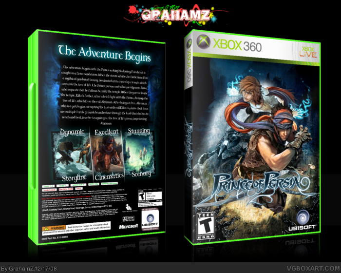
The big black area on the back = kills this box.
Fronts good, and the images used on the back and font is good, but it needs something more, im not saying over-do the box, but there are plenty of simple boxes that have a factor of real genious/quality/whatever about them, but this doesnt.
Front is awesome though, great work there.
ahha thanks qwerty yeah i suppose im underrated but i think its because not enough people author fav me. and i usually post my box's in the morning to they dont get that much attention but thanks for the fav and auth fav :D
 Prince of Persia Box Cover Comments
First of all Credit to Indexenos for the awesome logo.
well im happy with this one really put all my effort into this one.
hope you guys like it as i enjoyed making it
all renders, presentation and reflections done by me.
[ Reply ]
Looks great man. I love the back layout especially.
[ Reply ]
cheers man i went for a basic back for once rather than complicating it and screwing it up as usual lol
thanks for the fave aC.Sleet and you too Drakxxx
Edited at 1 decade ago
[ Reply ]
Nice.
I'll fave
[ Reply ]
thank you very much :D
[ Reply ]
this > me.
Epic shizzle.
[ Reply ]
This an EPIC WIN. Great work on the back layout! +fav
[ Reply ]
This is nice. I'm glad you made the back much better. :)
[ Reply ]
very nice ;)
[ Reply ]
The front has been done to death and the back looks like you kinda ripped off Icefox :(
[ Reply ]
Woah the back is mega blurry.
[ Reply ]
thats for the EPIC's haha lol
err the reason its the same as icefox's back is because that is the background image used in the official website. its because me and icefox are smart :D ;)
#11 yeah sorry about that i will update with better resolution :)
[ Reply ]
The big black area on the back = kills this box.
Fronts good, and the images used on the back and font is good, but it needs something more, im not saying over-do the box, but there are plenty of simple boxes that have a factor of real genious/quality/whatever about them, but this doesnt.
Front is awesome though, great work there.
[ Reply ]
this isnt a simple box..... this took me a good few hours. but thanks for the fav.
[ Reply ]
#14, im referring to #3, 'basic back' :)
[ Reply ]
Intense box!
You are so underrated it's not even funny.
+fav +author fav
[ Reply ]
ahha thanks qwerty yeah i suppose im underrated but i think its because not enough people author fav me. and i usually post my box's in the morning to they dont get that much attention but thanks for the fav and auth fav :D
[ Reply ]
Very good Graham. I like the effect on the back. Also I love the front. 4.5/5 Fantastic.
[ Reply ]
cheers man :D
almost there guys :D
Edited at 1 decade ago
[ Reply ]
>>hey i dont usually do this but im soo close in getting HoF for my POP box could you comment/fav you could be a big help.<<
right... that`s fishing for compliments and that`s just... ACK! Box is looking way too bulky and the edges are to spikey.
[ Reply ]
The Box is a bit to bulky and the XBOX 360 isn't that readable but very good, the artwork's used loads though
[ Reply ]
thats imandix makes it like that. but ive learned a new technique so ill be usuing that from now on.
[ Reply ]
Congrats on HoF =D
[ Reply ]
woohoo 2 HoF's in 1 Day thanks ALOT guys. :D
[ Reply ]