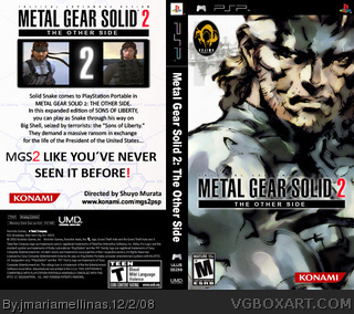
 Metal Gear Solid 2: The Other Side Box Cover Comments
Comment on jmariamellinas's Metal Gear Solid 2: The Other Side Box Art / Cover.

Comment on jmariamellinas's Metal Gear Solid 2: The Other Side Box Art / Cover.
Metal Gear Solid 2 to PSP...
[ Reply ]
Any comments, pleeeeeeeeeaaaseeeee?
[ Reply ]
You shouldn't bump, but anyway, it's not bad. I would put the Konami logo in the upper left corner of the front and the Kojima Productions logo in the center bottom or the bottom right. On the back, it's also not bad. I would use the Metal Gear Solid type for the "MGS2 Like You've Never Seen it Before!" line and you could use some screens instead of using that shot of Snake from Smash Bros. Brawl. Also, a Raiden render should be incorporated into it somehow, as he's still part of the MGS2 story.
[ Reply ]
i really like this +fav
yes it needs work
i advise to take what tleeart suggested into consideration
looking forward to v2
[ Reply ]