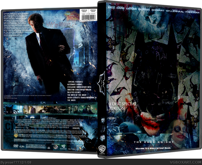
Here is my dark knight took 3 and a half days to make. also had to resize the box. Comments and Favorites Aprreciated I had fun making this. Credit to Indexenos for 3D DVD template.
Sorry about the chopiness of the DVD template.
What was the point of the 3D Temp? Literally. You didn't even make a flat version, you just placed your work on top of the 3D Temp, to somehow manipulate our poor souls.
The front is too messy. Can't tell whats going on. Back is too plain, and too bad.
@Xcore Too plain? I dont see that. Why the hell should i make a printable? It dosent matter. There are loads of good boxarts on here that are 3D and dont have printable's.
#2, What does him making a printable matter? You going to print it when you don't even like it? Anyways I think the box is to filtered and has to many effects. The front could look cool if it was clean looking.
Why should we shut up? we were voicing our opionon. BTW you said a flat version which is a printable. Did you even read my other post? It dosen't matter.
#12, I didn't even say printable. And no, a flat version doesn't have to a printable.
I was using sarcasm in #11 which you clearly couldn't damn grasp. What I was implying, just in case you still don't understand, whats the point of a 3D temp, if all of your work is just placed on top (e.g. Dark Knight logo), and not skewed at all. There's no point at all.
 The Dark Knight Box Cover Comments
Here is my dark knight took 3 and a half days to make. also had to resize the box. Comments and Favorites Aprreciated I had fun making this. Credit to Indexenos for 3D DVD template.
Sorry about the chopiness of the DVD template.
Edited at 1 decade ago
[ Reply ]
What was the point of the 3D Temp? Literally. You didn't even make a flat version, you just placed your work on top of the 3D Temp, to somehow manipulate our poor souls.
The front is too messy. Can't tell whats going on. Back is too plain, and too bad.
Overall image quality of the box is pretty low.
[ Reply ]
@Xcore Too plain? I dont see that. Why the hell should i make a printable? It dosent matter. There are loads of good boxarts on here that are 3D and dont have printable's.
Edited at 1 decade ago
[ Reply ]
#2, What does him making a printable matter? You going to print it when you don't even like it? Anyways I think the box is to filtered and has to many effects. The front could look cool if it was clean looking.
[ Reply ]
Well trev i plan on making a remade 2D version of this box.
[ Reply ]
#4, I think Xcore meant that the type elements are 2D put onto a 3D box, the text doesn't follow the 3D of the template.
It could use larger screenshots. I like the fact that the Joker isn't the main attraction on the back.
[ Reply ]
Thats pretty cool looking. Lol, i like how Ben Franklin is there too.
[ Reply ]
#6, Oh well you explained it better than he did. I didn't see what he meant because it is a little skewed so I didn't notice.
[ Reply ]
wow. i didnt like it when i first seen it but after seeing that the front has soo much detail i began to like it..... <<<-- sounds like a story
although i'm not a major fan of this. i have to fav and give you a 4/5 for effort.
p.s your underrated and your box's need more attention :)
[ Reply ]
thanks Graham
[ Reply ]
Please, shut up everyone, I didn't even say printable in my damn comment. Sheesh.
[ Reply ]
Why should we shut up? we were voicing our opionon. BTW you said a flat version which is a printable. Did you even read my other post? It dosen't matter.
Edited at 1 decade ago
[ Reply ]
#12, I didn't even say printable. And no, a flat version doesn't have to a printable.
I was using sarcasm in #11 which you clearly couldn't damn grasp. What I was implying, just in case you still don't understand, whats the point of a 3D temp, if all of your work is just placed on top (e.g. Dark Knight logo), and not skewed at all. There's no point at all.
[ Reply ]
#12, Xcore does have a point here.
[ Reply ]
Yes i see his point now lol Sorry xcore it was a misunderstanding
[ Reply ]