The front is very clean and nice. The logo on the spine is a little choppy and the text on the back of the box is hard to read. I have the same problem a lot of the time though. Its not bad though.
What more can be said that I, and the good folk of vgboxart.com haven't said already. Choppy, unprofessional, horrendous and quite frankly a bleeding cancerous eyesore.
Fitting however. A poor game for a poor craftsman.
Good day.
032/10
 Mirror's Edge Box Cover Comments
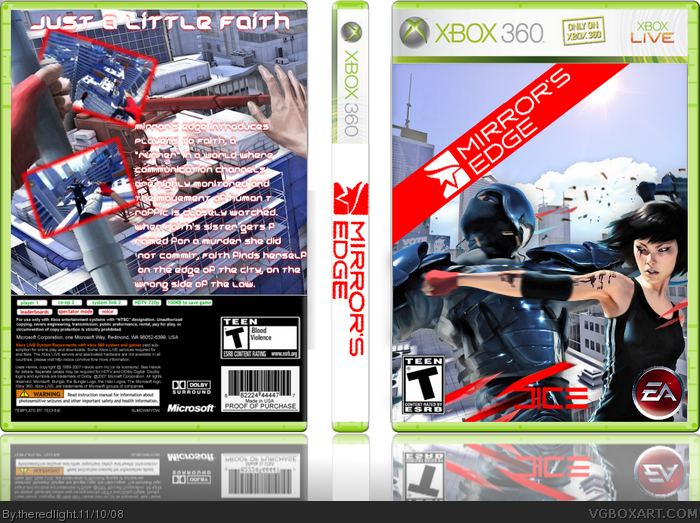
here's my mirror's edge box
commetn and enjoy credot to teniche for the temp.
and google for the renders on the cover.
comment and enjoy
#2,3 thanks
Edited at 1 decade ago
[ Reply ]
Not bad.
[ Reply ]
The front is very clean and nice. The logo on the spine is a little choppy and the text on the back of the box is hard to read. I have the same problem a lot of the time though. Its not bad though.
Edited at 1 decade ago
[ Reply ]
#2, I second that.
[ Reply ]
looks like all of Mirror's Edge boxes on the site =/
[ Reply ]
#5, yeah get confusing dosn't it? :P
Edited at 1 decade ago
[ Reply ]
What more can be said that I, and the good folk of vgboxart.com haven't said already. Choppy, unprofessional, horrendous and quite frankly a bleeding cancerous eyesore.
Fitting however. A poor game for a poor craftsman.
Good day.
032/10
[ Reply ]