
[ Box updated on November 10th, 2008 ] [ original ]
 Sonic the hedgehog special edition Box Cover Comments
Comment on supercrash7's Sonic the hedgehog special edition Box Art / Cover.
[ Box updated on November 10th, 2008 ] [ original ]
Comment on supercrash7's Sonic the hedgehog special edition Box Art / Cover.
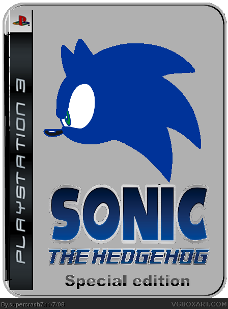
Ahem. "Special Edition" is not an excuse to put basically nothing on the box, y'know.
[ Reply ]
Credit : tin template : Radioactive Bob
Sonic/ logo sonic art archive
This is my first box.
Critisism is Appreciated.
EDIT wow your fast. But I tried adding a faded shadow and silver in the back round but it wasn't working :/ So I apologise to people who think its too plain. I'll try to update with a better backround
Edited at 1 decade ago
[ Reply ]
Its actually not bad considering its a special edition tin! You can sorta imagine Sega doing something like this for real. Welcome to the site man.
Edited at 1 decade ago
[ Reply ]
Thank you very much cerium ^_^
[ Reply ]
4/5
[ Reply ]
Excuse is not the right word. It's suppose to be plain and plain is not always a bad thing.
I suggest Supercrash does more to make Sonic's face blend in, try making it black and white and then make it a bit transparent. I recommend one of the really effective templates in the forum. Did you use MS Paint, it's choppy. You should use a better program like link
[ Reply ]
E_G do you know what the funny thing is?I had acutally made sonic's face black and white before I posted it here XD. Thanks for the advice and I will try to take it.
EDIT: OK I followed E_G's advice. I made sonic black and white and I managed to fix some of the choppyness (Mainly in the the PS3 spine). So does it look better now?
P.S Thanks for the fav ChuckECheese123
Edited at 1 decade ago
[ Reply ]
V2 is a lot better
[ Reply ]
I think version 2 is not bad at all. I'd of done an outer bevel on the image of sonic to make it look like it was set into the metal. as well as applied a texture background of metal like this. link
Those are effects in Photoshop, and I have no clue what program you're using. but it isn't bad at all really. An oddly plain, yet satisfying box. Nice work for a first. I'll be keeping an eye out on you.
If you need some tips or criticism on a box you can private message me on the forum, I'd be happy to help.
[ Reply ]
Sorry if this counts as bumping...
I've updated the box so that the logo is black and white. Please say if it is better or not.
#9 I use Paint.NET (Although I may be getting photoshop soon). I know it has the quality of a MS paint box but I'm trying to learn to make better boxes soon.
EDIT: V3 is the same as V4 apart from a small part of the choppyness gone
Edited at 1 decade ago
[ Reply ]
welcome to vgba! you should add ESRB and a background 4/5 use another font for special edition anddont get photoshop get gimp is pretty much easier and is free!
[ Reply ]
#11 Thanks! I was going to put a PEGI rating but I decided against it because this is just one of those tins with the game box inside. And I use Paint.NET because I find it easier to use
[ Reply ]