#10, Really bad text. Use white with a stroke or dark glow or drop shadow. And that was my point, Wii games have the ESRB on the left, regardless of where it is on your Mega Man X: Command Mission on GameCube.
Honestly, I don't know why I bother, you never listen to my suggestions.
 Mega Man X: Command Mission Box Cover Comments
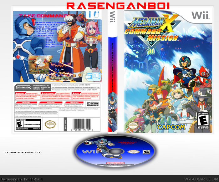
Newest box, I'm working on a back though... credit to techne for the template
Edited at 1 decade ago
[ Reply ]
Dont you think thats enough megaman? i would like to see you do more than one style =D The box is pretty good except for the logo being low qaulity
[ Reply ]
#2, ya, there was no logo's for the game that didn't have a black bg...
P.S. That's COMMANDER, Mega Man X to you, xD
Edited at 1 decade ago
[ Reply ]
this is good compaired to you megman x 4 box +fav
add a back the logo's blurry and a bit choppy 4/5
Edited at 1 decade ago
[ Reply ]
Why is X so dark next to the others? Also, I think you should make that comp of characters a little larger. And you cut off part of the logo.
As for ESRB and logo placement, it's not the same as GameCube, so you might want to shift it to the left side.
[ Reply ]
#5, actually, yes it is
[ Reply ]
link
link
Just a couple of examples.
[ Reply ]
#7, those are different games, not xcm, i have the game like, 5 inches away from me
[ Reply ]
#8, ...for GameCube.
[ Reply ]
#9, yup, updated btw
[ Reply ]
#10, Really bad text. Use white with a stroke or dark glow or drop shadow. And that was my point, Wii games have the ESRB on the left, regardless of where it is on your Mega Man X: Command Mission on GameCube.
Honestly, I don't know why I bother, you never listen to my suggestions.
Edited at 1 decade ago
[ Reply ]
the back is really good
[ Reply ]