I'm not a fan of all the flames or lava. The font seems a bad choice. In all, this reminds me of a mid/late 90's website, with the black and neon colors. Okay, it's not THAT bad, but I really don't think it fits the feel of the Halo series...not that I'd know.
If you were to rework this, I would look at official boxes and some of the better ones here. Usually the color scheme is lighter and/or cooler colors. Or very orange...
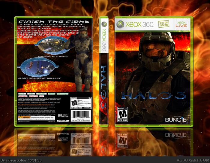
 Halo 3 Box Cover Comments
ok, this took alot of work and effort, but i'm really happy with how it turned out. Credit to Techne for temp. Enjoy!
[ Reply ]
I really like it. Its certainly original but the back seems to be lacking something 4/5 what program are you using?
[ Reply ]
I'm not a fan of all the flames or lava. The font seems a bad choice. In all, this reminds me of a mid/late 90's website, with the black and neon colors. Okay, it's not THAT bad, but I really don't think it fits the feel of the Halo series...not that I'd know.
If you were to rework this, I would look at official boxes and some of the better ones here. Usually the color scheme is lighter and/or cooler colors. Or very orange...
Edited at 1 decade ago
[ Reply ]
#2 i felt that way too... i use paint.net
[ Reply ]
Nice! 4/5
[ Reply ]
Use Photoshop...Its better,that looks not really realistic...so 2.5/5
[ Reply ]