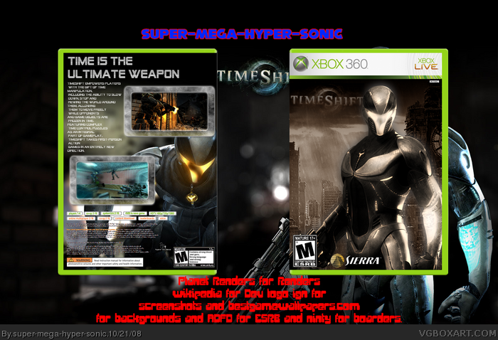
It's not good. The screenshot borders are ugly (no offense to Ninty) and don't work well for the game. They're too big and there should be more. The text is all crammed in there and you chose a bad font. The front and back don't match because the front has the sepia - which should be removed - and the back doesn't. The renders are both overused and you did nothing to make it stand out from the crowd. The logo is too small and the low opacity doesn't look good. The text on the background doesn't look good and the background is just a wallpaper - logo and all.
 Timeshift Box Cover Comments
Ok i'v tried hard on this,i can't be bothered with wips that much so i decided to finish it now.
[ Reply ]
its pretty good, good job
[ Reply ]
wow...not more than wow...
[ Reply ]
#2, thanks roza i'm really trying to get rank 5.
[ Reply ]
It's not good. The screenshot borders are ugly (no offense to Ninty) and don't work well for the game. They're too big and there should be more. The text is all crammed in there and you chose a bad font. The front and back don't match because the front has the sepia - which should be removed - and the back doesn't. The renders are both overused and you did nothing to make it stand out from the crowd. The logo is too small and the low opacity doesn't look good. The text on the background doesn't look good and the background is just a wallpaper - logo and all.
[ Reply ]
#5, the front isn't just a wallpaper this was the walllpaper i used
this as the original background link
[ Reply ]
The borders are too big, the color scheme doesn't catch your attention, but it's not too bad. I'll fav it.
I'd put some color back into the main character on the front, though and make the logo more noticable.
Edited at 1 decade ago
[ Reply ]
#6, I didn't say the front is a wallpaper, I said the background is a wallpaper. As in, behind the box.
[ Reply ]