Wow, couldn't believe it wasn't official! Very awesome work and great color scheme! Reminds me of the colors for Wario World for GameCube. Very cool. 5/5
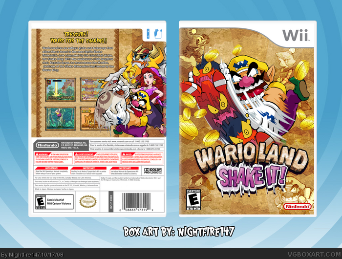
"Just a quickie I did while talking on the phone with a friend." + the image of Wario, I am truly sorry for being "that guy," I really am...but...bahaha.
That said, excellent box. It's simple and clean and just very well laid out.
 Wario Land: Shake It! Box Cover Comments
Just a quickie I did while talking on the phone with a friend. Comments and critiques welcome!
[ Reply ]
Wow, couldn't believe it wasn't official! Very awesome work and great color scheme! Reminds me of the colors for Wario World for GameCube. Very cool. 5/5
[ Reply ]
Ooohhhhh....
[ Reply ]
Good job, the back description is plain for a Wario game. I'd like to see you use a wackier font.
[ Reply ]
This is awesome, I really like the background choice too.
[ Reply ]
IMO, best ShakeIt box on site. Outstanding job.
[ Reply ]
I really like how the only colors are the logo and the characters. It really makes them stand out.
The back design is awesome, keep it up.
[ Reply ]
This is brilliant.
[ Reply ]
"Just a quickie I did while talking on the phone with a friend." + the image of Wario, I am truly sorry for being "that guy," I really am...but...bahaha.
That said, excellent box. It's simple and clean and just very well laid out.
[ Reply ]
Nice!
[ Reply ]
I like it! like ice fox said simple and clean.
[ Reply ]
Oh wow, it's great!
It's so simple!
Oh, but I think the artwork in the back is overlapping the screens a bit too much. it's very nicely done!
[ Reply ]
Wow, great job!
[ Reply ]