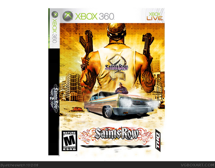
At first I thought this was just the official with a poster effect and some rearranged logos, I did notice it wasn't. It's ok, it's weird having two SR 2 logos and I will prefer the position of the THQ logo to be normal. The block around the ESRB is too much and as someone else stated, the car area in the middle is too blurry.
fuzzy car.
two logoes.
esrb is jacked up
thq is misplaced and misscaled.
you tried to cover up the junk on the bottom of the poster, but didnt get it all.
the spine is bland and its not a pal box.
effort, if it means you have to save your box and come back to it later, then so be it.
 Saints Row 2 Box Cover Comments
my 10 th box. please comment and rate. i know the car is a fuzzy image but i was in a rush so update soon.
Edited at 1 decade ago
[ Reply ]
no real prollems apart from fuzzy car but apart from that very good, maby ext time just take longer.
[ Reply ]
i just noticed that there is like some stuff under the title. maby it is from the old cover but it needs to be erased
[ Reply ]
i will. i don't usually rush these.
[ Reply ]
thats shadow but it didn't work too well.
[ Reply ]
un shadow it then, then it would (apart from fuzzy car) look perfect
[ Reply ]
At first I thought this was just the official with a poster effect and some rearranged logos, I did notice it wasn't. It's ok, it's weird having two SR 2 logos and I will prefer the position of the THQ logo to be normal. The block around the ESRB is too much and as someone else stated, the car area in the middle is too blurry.
[ Reply ]
this is bad.
fuzzy car.
two logoes.
esrb is jacked up
thq is misplaced and misscaled.
you tried to cover up the junk on the bottom of the poster, but didnt get it all.
the spine is bland and its not a pal box.
effort, if it means you have to save your box and come back to it later, then so be it.
[ Reply ]
yes i know. like i said i don't usually rush them.
[ Reply ]
theres no proplem the car is just a little fuzzy overall its good
[ Reply ]