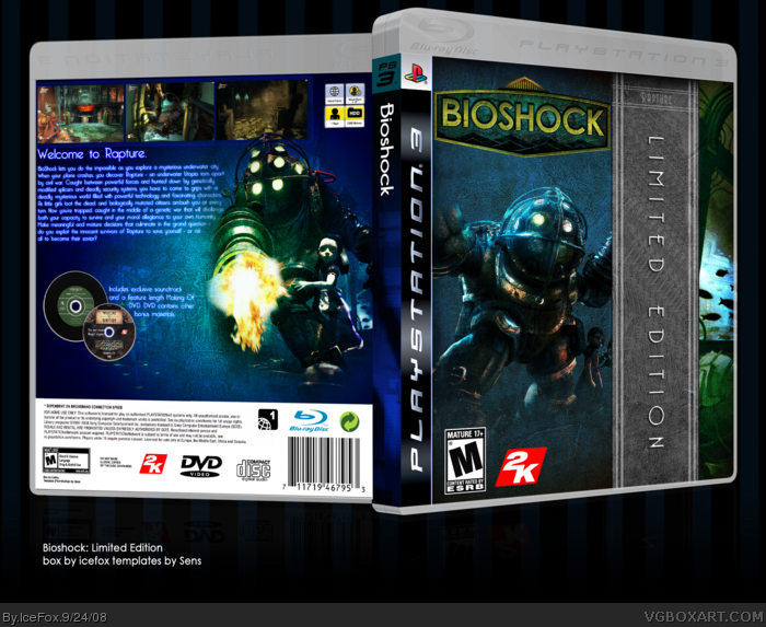
I don't like the design. The way you have the "limited edition" text along the side doesn't look good, and I don't like how you have the image on the other side. The render of Big Daddy is overused and the fading on his feet could be better.
I don't like the text on the back and the fading on the image doesn't look good. You could have tried something to make the screens look more interesting.
I'm not going to say that it's too plain because I know you were going for minimalism, but I don't like it.
 BioShock Box Cover Comments
Full view please. Printable coming soon.
[ Reply ]
this is freakin' nice man.
[ Reply ]
Holy poop.
[ Reply ]
haha you finaly filled the gap. great work. I think you got dvd on there twice and is that a record lol?
[ Reply ]
link
That's what this box means. It's amazing
[ Reply ]
great work
[ Reply ]
Awesome!
[ Reply ]
The template is wrong, and has been used badly...
[ Reply ]
Needs more attention.
[ Reply ]
9, thanks.
[ Reply ]
More attentionn...
[ Reply ]
I don't like the design. The way you have the "limited edition" text along the side doesn't look good, and I don't like how you have the image on the other side. The render of Big Daddy is overused and the fading on his feet could be better.
I don't like the text on the back and the fading on the image doesn't look good. You could have tried something to make the screens look more interesting.
I'm not going to say that it's too plain because I know you were going for minimalism, but I don't like it.
[ Reply ]
Let's bump this one to the HoF!
[ Reply ]