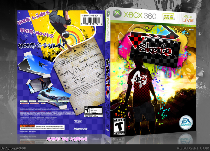
My.Dear.God.
This has been an intense process, and perhaps my highest-effort box to date.
After spending an entire week on the front, and about 2/3 days on the back, photoshop corrupted my file.
I had to re-do the entire back cover!
After spending another 2 days on the back, im finally satisfied with the final product.
Thanks to everyone at BYTD for the great feedback, and help throughout the process =]!
Also, please, if given critique on the front, i can't fix it.. [ corrupted file,remember? ]....
does anyone not notice how blatantly badly organised the back info part is? it's all over the place... look at a real box. No copyright info... the microsoft logo is just placed randomly in the middle... barcode up the top... it's all wrong.
#12, ok. seriously. didn't we agree you'd get off of my back?
Please do NOT respond to this comment. if you wish to comment on what i just said, just PM me.
Im updating it atm, with ''skate'' instead of austin powers, and EA text ;)
#12, wow, Vengeance, Ayron spent two weeks on this box, with an extremely creative layout and a lot of details, only for you to be complaining about legal info?! Wow, you're a bigger nitpicker than what I gave you credit for. -.-+
#27, fuck you, it's such a blatant flaw it's not even funny. two weeks? i doubt it... no offense, but if he had spent SO MUCH EFFORT into this whole thing I would at least expect him to make it look more officially looking. Jesus, do you not notice it? Can you not notice that gigantic empty space at the bottom? Look at the official back... link compare them. Look how nicely organised everything is at the bottom... you have a barcode at the very top, T rating is too small... no "game experience may change" underneath the rating on the front... hell he didn't even make a matching EA logo, he just used an old one from The Sims or something. If he seriously took two weeks then the least I expect him to do is make it look neat. I cannot believe you all expect me to suck his dick, this has a nice design but these flaws are so noticeable it really questions whether you're all faving to suck up to the rank niners.
#30, Chill Greg. It's about time you actually give Ayron a break and not force baggage on him. We both know that it's their choice when they want to fav it, you should not get hostile because their opinion of his work does not flow with yours. It is better that you do not comment when you are going to say people are doing things like "sucking dick".
I'm glad I haven't seen it either. I really don't know why he has such a large grudge against you, but forget him, you have plenty more people that really like your work. I really like this box, it doesn't really capture the essence of skate, but as a stand alone box, it's really nice. Great work, mate ;)
Cool box... real stylish. I do agree with Vengeance about the back logos etc. Everyone complains when people don't put ratings on back, or logos too close to edge etc. It gets me when people do put legal text etc. correctly... but that's just me.. as I like to make perfect covers as possible. HOWEVER, great stuff Ayron -- not so keen on the writing on the pad.. I really think a older skateboarder can write/doodle better - LOL
I love this box to be honest. Not sure what Greg said there, but part of the reason why I admire Ayron's work is that it's always creative and tries to break from the norm.
I mean seriously, who really gives a damn about technical shit like dev logo placement, copyright info (etc etc) when you have a box that looks this good? I know that I probably can't talk since I make my boxes very accurate (info wise) like the official ones in stores - But I have to point out that focusing on those things instead of the actual design won't get you very far as far as your creative mind is concerned.
Back to the box. The back has a simple, but very effective design. The front, however, is just drop dead gorgeous. Truly one of the most creative boxes I've seen in the site.
 Skate Box Cover Comments
Undeniable win.
You forgot to un-hide the EA copyright text, though. =P
[ Reply ]
#1, agreed. Nice box art d00d! :P
[ Reply ]
My.Dear.God.
This has been an intense process, and perhaps my highest-effort box to date.
After spending an entire week on the front, and about 2/3 days on the back, photoshop corrupted my file.
I had to re-do the entire back cover!
After spending another 2 days on the back, im finally satisfied with the final product.
Thanks to everyone at BYTD for the great feedback, and help throughout the process =]!
Also, please, if given critique on the front, i can't fix it.. [ corrupted file,remember? ]....
So,all there is left to say, is, "Enjoy!"
[ Reply ]
Could use plastic, and the EA text. Otherwise it's great, though. Definately different.
[ Reply ]
amazing
but above the barcode it says "Austin Powers: International Man of Mystery" ^^
[ Reply ]
wow thats pretty amazing
fav
[ Reply ]
:O u...u..
[ Reply ]
Sorry for all the minor errors like EA text and Austin powers text people..
its really hard for me to fix it now... i MIGHT fix it later on,though..
also, full view plz, and i'm uploading printable.
-edit- can't find friggin EA text >.>
Edited at 1 decade ago
[ Reply ]
#8, My bad, there is none haha.
Shouldn't be that hard to edit though, it's already a text layer, you just edit it. =D
[ Reply ]
Add some plastic around the template and it'll be perfect!
Well, its perfect already but it would make it even more perfect =D
Either way, +fav
[ Reply ]
whoaaa.
[ Reply ]
does anyone not notice how blatantly badly organised the back info part is? it's all over the place... look at a real box. No copyright info... the microsoft logo is just placed randomly in the middle... barcode up the top... it's all wrong.
[ Reply ]
#12, ok. seriously. didn't we agree you'd get off of my back?
Please do NOT respond to this comment. if you wish to comment on what i just said, just PM me.
Im updating it atm, with ''skate'' instead of austin powers, and EA text ;)
[ Reply ]
Nice nice nice.
Subliminal advertising :P
[ Reply ]
i dont realy like any of the font on the front and back. The box desighn is good but the logo and the back headlines.
[ Reply ]
The creativity alone has earned my fav.
[ Reply ]
this box is win
[ Reply ]
Very creative! +fav
[ Reply ]
hey it's posted! Great piece of work here, sir!
[ Reply ]
that is sweet FAVE
[ Reply ]
Gorgeous! Glad to see how well it came out!
[ Reply ]
Did someone say hall?
And er... On the back, on the piece of paper, does it say Saxon Backwards?
Cause thats liek... Mah Name o.O''
[ Reply ]
Grats on the speedy HoF!! :)
[ Reply ]
#22, actually, satan.:P
Thanks everyone!:D
[ Reply ]
this is damn creative.
[ Reply ]
#22 Your name is Saxon?
My cousins name is Viking ^.^
[ Reply ]
#12, wow, Vengeance, Ayron spent two weeks on this box, with an extremely creative layout and a lot of details, only for you to be complaining about legal info?! Wow, you're a bigger nitpicker than what I gave you credit for. -.-+
#28, no, E_G, I'm not.
Edited at 1 decade ago
[ Reply ]
#27, Are you trying to pick an Internet fight?
[ Reply ]
#28 Its Chibi Cloud! Of course he aint =]
[ Reply ]
#27, fuck you, it's such a blatant flaw it's not even funny. two weeks? i doubt it... no offense, but if he had spent SO MUCH EFFORT into this whole thing I would at least expect him to make it look more officially looking. Jesus, do you not notice it? Can you not notice that gigantic empty space at the bottom? Look at the official back... link compare them. Look how nicely organised everything is at the bottom... you have a barcode at the very top, T rating is too small... no "game experience may change" underneath the rating on the front... hell he didn't even make a matching EA logo, he just used an old one from The Sims or something. If he seriously took two weeks then the least I expect him to do is make it look neat. I cannot believe you all expect me to suck his dick, this has a nice design but these flaws are so noticeable it really questions whether you're all faving to suck up to the rank niners.
[ Reply ]
#30, Chill Greg. It's about time you actually give Ayron a break and not force baggage on him. We both know that it's their choice when they want to fav it, you should not get hostile because their opinion of his work does not flow with yours. It is better that you do not comment when you are going to say people are doing things like "sucking dick".
[ Reply ]
i believe i should be glad that i did not see what Greg posted.
Thanks everyone ;)
[ Reply ]
I'm glad I haven't seen it either. I really don't know why he has such a large grudge against you, but forget him, you have plenty more people that really like your work. I really like this box, it doesn't really capture the essence of skate, but as a stand alone box, it's really nice. Great work, mate ;)
[ Reply ]
Cool box... real stylish. I do agree with Vengeance about the back logos etc. Everyone complains when people don't put ratings on back, or logos too close to edge etc. It gets me when people do put legal text etc. correctly... but that's just me.. as I like to make perfect covers as possible. HOWEVER, great stuff Ayron -- not so keen on the writing on the pad.. I really think a older skateboarder can write/doodle better - LOL
[ Reply ]
I love this box to be honest. Not sure what Greg said there, but part of the reason why I admire Ayron's work is that it's always creative and tries to break from the norm.
I mean seriously, who really gives a damn about technical shit like dev logo placement, copyright info (etc etc) when you have a box that looks this good? I know that I probably can't talk since I make my boxes very accurate (info wise) like the official ones in stores - But I have to point out that focusing on those things instead of the actual design won't get you very far as far as your creative mind is concerned.
Back to the box. The back has a simple, but very effective design. The front, however, is just drop dead gorgeous. Truly one of the most creative boxes I've seen in the site.
[ Reply ]
I really like this box, nice job nigga
[ Reply ]
Brilliant.
[ Reply ]