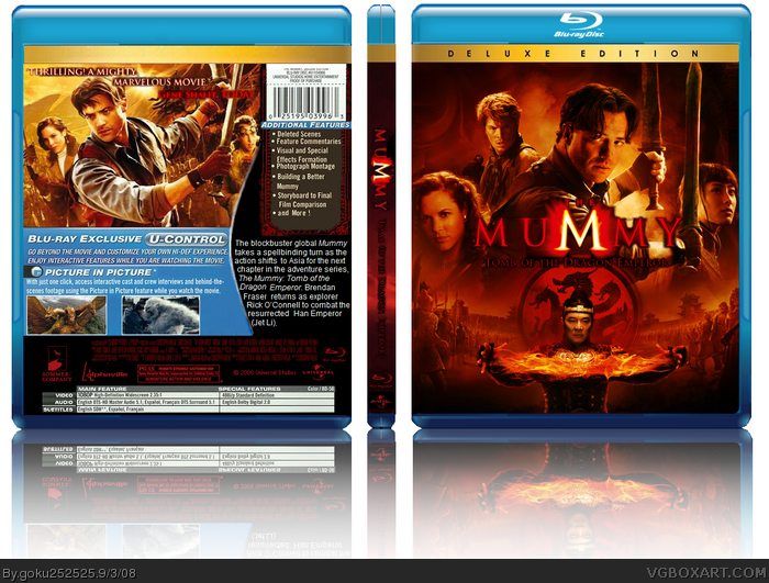
I know i said i wouldnt be making a back anytime soon but i really wanted to have a go at making another one because i wasnt completely satisfied with my hellboy 2 back and i really want to keep trying and get better^^ Anyway goodnight and enjoy.
The front is pretty good, even though it's just the official poster with the logo moved to the middle. link
The back is pretty rough. The cast/crew billing at the bottom is too blurry to read at all. I think it would be better if you made the blue "U Control" section smaller and less predominant. The description/synopsis text looks like it's been pushed nearly off of the box and and its isolated from the image so your eye isn't drawn to it at all. I would expand the image at the top, drop the "U contol" stuff down and to the right, and put your synopsis over the bottom-third of the picture. It would flow so much better!
 The Mummy: Tomb of the Dragon Emperor Box Cover Comments
I know i said i wouldnt be making a back anytime soon but i really wanted to have a go at making another one because i wasnt completely satisfied with my hellboy 2 back and i really want to keep trying and get better^^ Anyway goodnight and enjoy.
[ Reply ]
It looks pretty good, I'm guessing you aren't using paint anymore?
[ Reply ]
Nice, but for New Zealand time I find it is best to upload at about 8-10 am rather than late at night here.
[ Reply ]
Awesome job, it looks very official looking.
[ Reply ]
#4, agreed. The only thing I don't like is the font used on the back.
[ Reply ]
#4, Agreed looks pretty sweet
[ Reply ]
That's just awesome.
[ Reply ]
sweet
[ Reply ]
The front is pretty good, even though it's just the official poster with the logo moved to the middle. link
The back is pretty rough. The cast/crew billing at the bottom is too blurry to read at all. I think it would be better if you made the blue "U Control" section smaller and less predominant. The description/synopsis text looks like it's been pushed nearly off of the box and and its isolated from the image so your eye isn't drawn to it at all. I would expand the image at the top, drop the "U contol" stuff down and to the right, and put your synopsis over the bottom-third of the picture. It would flow so much better!
[ Reply ]
#2, nope^^
Oh and i forget to credit sentry for the temp.
Edited at 1 decade ago
[ Reply ]