you should be used to PAL boxes.
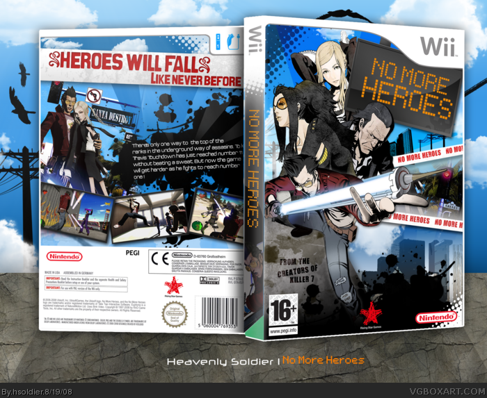
The spine is white, and it stands "Licanced by" over the Nintendo logo, and PAL on the right of the logo.
but thats no big deal, so fav!
and like Dersnap sais, 'grats on rank 8.
This is pretty good I like how you did a style for this game that no one has done for it yet. But I dont really like the logo and how you repeated the name of the game 3 times on the front
You didn't listen to any of my suggestions, but it's still awesome. I think you might be overdoing the rising sun effects on your boxes a little bit ;)
No need to comment... since you are constantly on MSN asking me to view your WIP! LOL --- nice one... and different. Glad you acted on my suggestions, unlike some people! LOL --- although you never put the quote on the front bottom/right. OH, since you used my Wii Temp.. I don't think the PEGI icon should be on the back next to the CE.
 No More Heroes Box Cover Comments
holy crap this is amazing.
[ Reply ]
OH MY.
[ Reply ]
Fuck my carrot.
[ Reply ]
lol thanks guys yup its a no more heroes box that WOot is not red :D hope you like it alot of time and effort was put into this :D
Edited at 1 decade ago
[ Reply ]
a fresh no more heroes concept.
me likes it.
[ Reply ]
gasp it's bloo.
Ba dum pish
[ Reply ]
#6, Def Leppard is so not Def.
Oh, and I already told you this over MSN and on your profile but whatever, 'grats on rank 8.
Edited at 1 decade ago
[ Reply ]
<___OO___>
Edited at 1 decade ago
[ Reply ]
Yes indeedy.
[ Reply ]
thanks guys :D yes indeedy vengance :D
[ Reply ]
you should be used to PAL boxes.
The spine is white, and it stands "Licanced by" over the Nintendo logo, and PAL on the right of the logo.
but thats no big deal, so fav!
and like Dersnap sais, 'grats on rank 8.
[ Reply ]
Awesome job man.
[ Reply ]
Screw you >.>..
i was about to upload a box!!![yeah,sue me..]
>.<"!
[ Reply ]
lol thanks guys
#14 oxol i like making custom spines leaving it white is boring..?
Edited at 1 decade ago
[ Reply ]
so well done!
[ Reply ]
Well done mate
[ Reply ]
thanks
[ Reply ]
Obviously your best box.
[ Reply ]
Awesome!!!
[ Reply ]
thanks guys
[ Reply ]
Pretty amazing!
And 'grats on rank 8! I knew it wouldnt be long till you caught up with me =D
[ Reply ]
thanks
[ Reply ]
#14, Yes, its your own choise to make custom spine, but personaly I prefer white spines.
It feels more Wii-ish then.
[ Reply ]
8D
[ Reply ]
thanks guys
[ Reply ]
This is pretty good I like how you did a style for this game that no one has done for it yet. But I dont really like the logo and how you repeated the name of the game 3 times on the front
[ Reply ]
Congragulations on rank 8 dude!! And check yout notifications!
[ Reply ]
Best No More Heroes cover, ever!
[ Reply ]
thanks
[ Reply ]
Awesome, really nice design and unique.
[ Reply ]
Dude that is sick
[ Reply ]
thanks :D
[ Reply ]
fav+
[ Reply ]
Brilliance.
[ Reply ]
thanks guys!
[ Reply ]
Aint you getting tired of saying tat soon :D
[ Reply ]
Ths box sure looks good with that medal down there.
[ Reply ]
Gragulations! :D
[ Reply ]
You didn't listen to any of my suggestions, but it's still awesome. I think you might be overdoing the rising sun effects on your boxes a little bit ;)
[ Reply ]
Awesome job, the NMH boxes were starting to become too similar.
[ Reply ]
#39, Agreed.
Still a very wonderful and unique design. Awesome work!
[ Reply ]
No need to comment... since you are constantly on MSN asking me to view your WIP! LOL --- nice one... and different. Glad you acted on my suggestions, unlike some people! LOL --- although you never put the quote on the front bottom/right. OH, since you used my Wii Temp.. I don't think the PEGI icon should be on the back next to the CE.
[ Reply ]
Uploaded Printable :D
[ Reply ]
love it 5/5 and fav
[ Reply ]