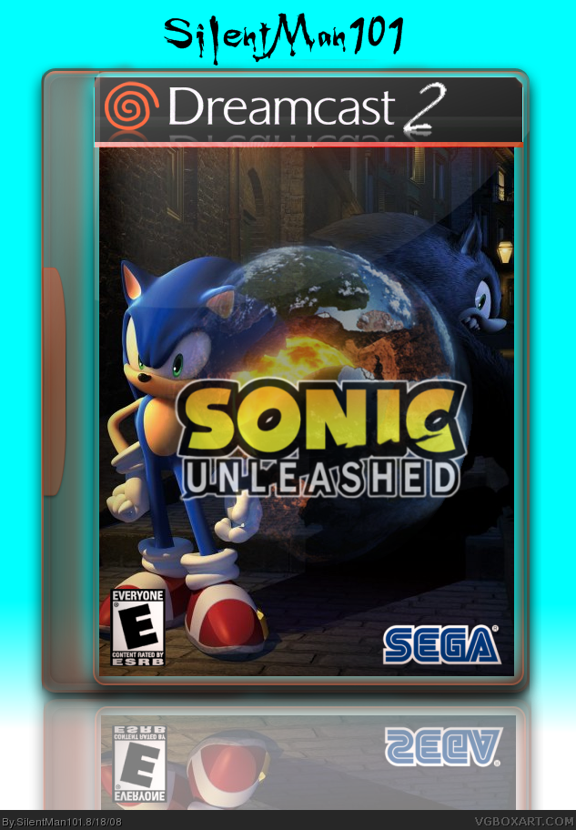
I would make the planet smaller so it's not covering any of sonic's face, but just his quills.
The logo should be moved down so Sonic's head isn't blocked and it should not be transparent at all. The logo is usually a selling point, you don't want that to fade into the background.
Oh, my god! Your best ever. The back is amazingly simple, and I think the text could use a thin black stroke, but man. This is like amazing. I really like it! 10/5!
#3, well its not nice for you to kinda steal the temp from deviant art, all you did was add a dc2 logo on the top and added legal info.... really your temp.
its like 99% his work.
ooooh an silentman its a nice box
 Sonic Unleashed Box Cover Comments
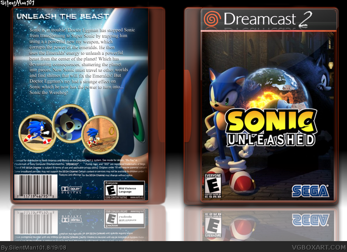
I do plan on making a back. Credit to TheElectricFrost for the temp
Edited at 1 decade ago
[ Reply ]
fav
[ Reply ]
it nice to see people using my temp. :)
[ Reply ]
I really like this one, from the temp to the picture arrangement. Nice work Silent! 5/5
Edited at 1 decade ago
[ Reply ]
Great, but make the planet smaller and less transparent.
[ Reply ]
#2, Thanks!
#4, Thank You Very Much!
#5, I tried to fix that. But if people like version 1 better i'm switching back.
#8, Idk It did not look right lol But now I fixed it!
So people look at Version 1 and 2 and tell me which one you like the most!
Edited at 1 decade ago
[ Reply ]
i like two
[ Reply ]
Why did you move the logo? it's covering half of Sonic's face now.
[ Reply ]
It actually looks great.
[ Reply ]
Wow, this looks really cool so far! 5/5
[ Reply ]
Great Box! 5/5 + fav
[ Reply ]
I would make the planet smaller so it's not covering any of sonic's face, but just his quills.
The logo should be moved down so Sonic's head isn't blocked and it should not be transparent at all. The logo is usually a selling point, you don't want that to fade into the background.
[ Reply ]
Updated with a back and made the logo NOT transparent.
#12, I wanna keep the planet the way it is because its a big, main part of the game so it should be noticeable not hidden or smaller.
[ Reply ]
Thanks for the fav Sonic! Anyone else? And doesn't the back look more like a DVD back? lol
But I do love Sonic's WTF face on the back ;p
Edited at 1 decade ago
[ Reply ]
Oh, my god! Your best ever. The back is amazingly simple, and I think the text could use a thin black stroke, but man. This is like amazing. I really like it! 10/5!
#4, Disregard this comment. That was demeaning.
Edited at 1 decade ago
[ Reply ]
#15, Thank You very much! Im really glad that you liked it SO much that you commented it again! And I will disregard comment 4 lol.
[ Reply ]
#3, well its not nice for you to kinda steal the temp from deviant art, all you did was add a dc2 logo on the top and added legal info.... really your temp.
its like 99% his work.
ooooh an silentman its a nice box
[ Reply ]
#17, Hum I did not even realize that you commented! Thanks!
Edited at 1 decade ago
[ Reply ]
This is one of the best Sonic Unleashed box I've seen +fav
[ Reply ]
#19, Lol I never seen this comment O.o But thanks!
[ Reply ]
This deserves HOF too.
[ Reply ]