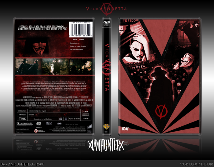
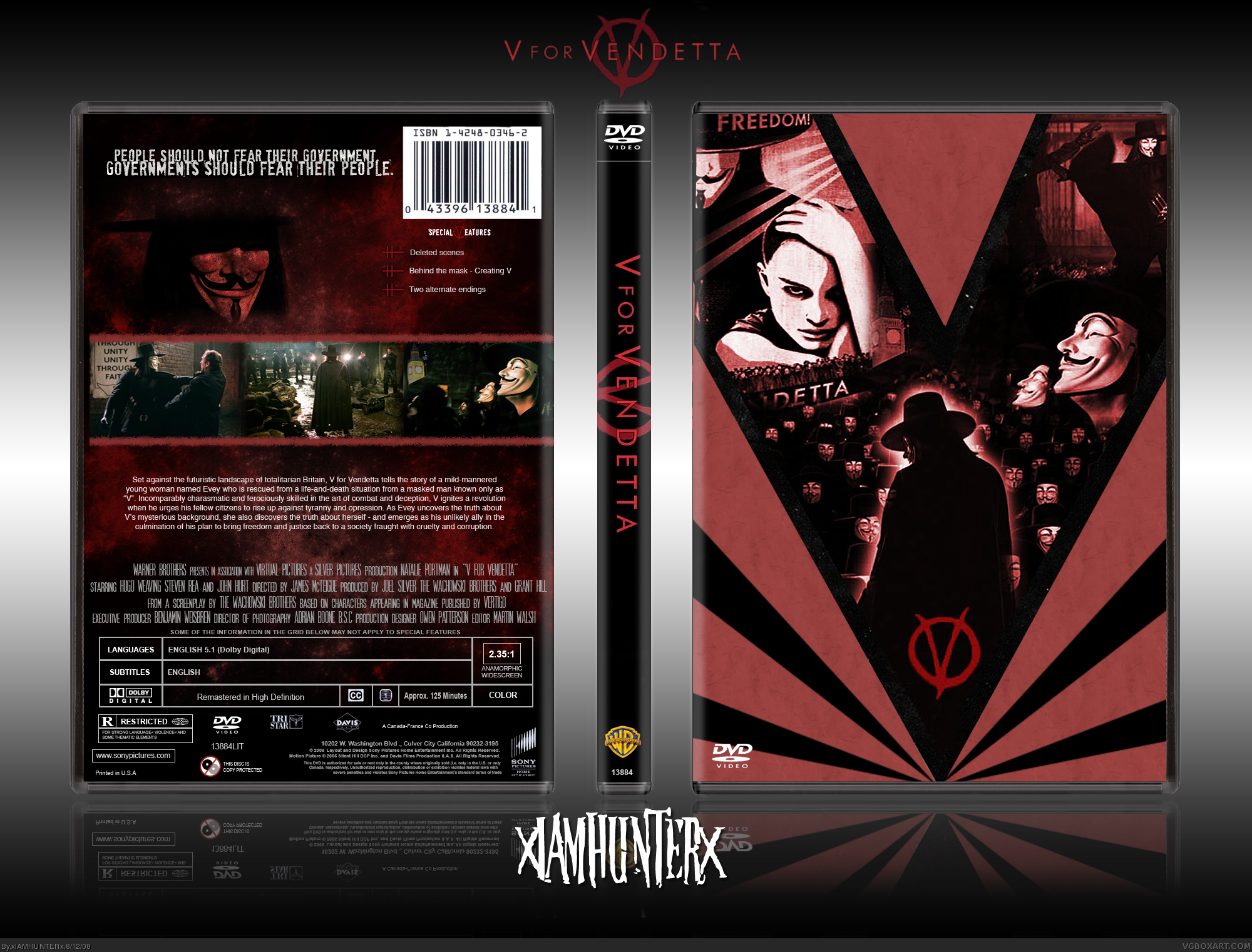
I like the design. The cover is certainly an art piece. I'd suggest you remove the DVD logo from the front since you don't have any title, cast, director or tagline text. I think it works if you treat it like a special edition sleeve and not so much a cover. The back is great the way it is. I wouldn't change the summary text at all. The design is minimalist and artsy and really works to sell the special edition look. Finally, I'd colour the "WB" logo on the spine to match the red theme. It would blend in a bit better. Cool stuff. Nice job!
The back could be much better, the top part of V's head looks a bit cut off and the text could be a bit bigger and be better placed. Front is kickass though, from concept to execution. Great job.
This is really great work! I do agree with #7 about taking the dvd logo off the front as well as making the spine WB red to match the color scheme, but besides those two minor details, it's aaallll good.
 V for Vendetta Box Cover Comments
"Behind this mask there is more than flesh. There is an idea, Mr. Creedy, and ideas are bulletproof."
-----------
Credit to Steven for the temp.
[ Reply ]
#1, why must you be so good? fave.
Edited at 1 decade ago
[ Reply ]
:D
The summary would look better if it were larger, but what the hell, fav.
[ Reply ]
Vera Nice. +fav
[ Reply ]
Not to fond of the rising sun V's, Back is pimpin though.
[ Reply ]
so stlylish :D
[ Reply ]
I like the design. The cover is certainly an art piece. I'd suggest you remove the DVD logo from the front since you don't have any title, cast, director or tagline text. I think it works if you treat it like a special edition sleeve and not so much a cover. The back is great the way it is. I wouldn't change the summary text at all. The design is minimalist and artsy and really works to sell the special edition look. Finally, I'd colour the "WB" logo on the spine to match the red theme. It would blend in a bit better. Cool stuff. Nice job!
[ Reply ]
This is a true blokes work of art.
Yeah that made no sense.
[ Reply ]
Great I like the front design!
[ Reply ]
i agree with #9, the front is cool and so is the back but personally i dont think they flow so well as one box.
[ Reply ]
i really like the cover
[ Reply ]
A for Awesome. ;)
Edited at 1 decade ago
[ Reply ]
The front most definitely kicks ass.
The back is well designed also.
[ Reply ]
Stylish.
[ Reply ]
good work
[ Reply ]
Oh, nuts.
[ Reply ]
I just noticed, you should probably paint over "detta" on the top left poster.
[ Reply ]
My oh my brilliant.
Fav of course.
Edited at 1 decade ago
[ Reply ]
Not bad. But a title on the front wouldnt hurt.
[ Reply ]
Agreed with ff22. Still, pretty damn awesome =D
[ Reply ]
Like I said in the critiques forum, yummy. 5/5 and fave.
[ Reply ]
Printable added.
[ Reply ]
The back could be much better, the top part of V's head looks a bit cut off and the text could be a bit bigger and be better placed. Front is kickass though, from concept to execution. Great job.
[ Reply ]
God, so awesome! :D
[ Reply ]
This is really good, the style.
[ Reply ]
sick i just dont like when there is a picture that is on both sides
[ Reply ]
Amazing. Makes me drool. Love the movie, love this design.
[ Reply ]
This is really great work! I do agree with #7 about taking the dvd logo off the front as well as making the spine WB red to match the color scheme, but besides those two minor details, it's aaallll good.
[ Reply ]
Great art style :)
[ Reply ]
50 ! brrrrrrrrrrrrrrroooooooooooo ;3
[ Reply ]