#7, I hate drop shadows. They're overused. I may add some stroke to the characters to make them stand out a bit. Dunno. This was a real quick box. Not sure if I really want to spend any more time on it.
#8, Yeah I agree with you. All of the art (logo included) are ripped from the trailer, so I kept the original colors. Maybe I'll blue wash the whole thing and see how that looks.
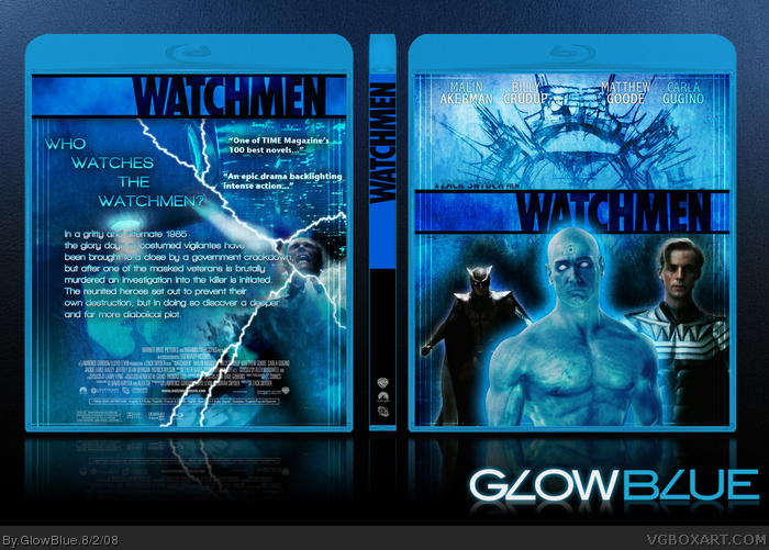
I made quite a few changes, taking the suggestions from you guys. Changed the tagline on the back. Changed the text appearance on the back. Removed the yellow from all of the banners. Blue-washed the front and back to blend the characters and backgrounds better. Added drop shadow to the actor billing on the cover to make the text stand out. Hope you like.
#12, You have not seen Dark Knight yet! Oh, the horrors! BTW, it's a comic made by DC, not sure what the story is about though. The new box looks very good, but back text looks weird, and the man on the far left of the front is too tiny.
 Watchmen Box Cover Comments
I'm pretty excited about this movie. How about the rest of you?
[ Reply ]
I honestly thought it didn't look very good, but this box is awesome.
[ Reply ]
Nice job +Fav
[ Reply ]
I love the front but the back is not great. I do not like the layout on the back and the text font looks dull.
4/5
[ Reply ]
Amazing job on the front.
+fav
[ Reply ]
For the tag you should have used "who's watching the watchmen," seeing as that seems to be a catchier phrase. The box looks decent anyways.
[ Reply ]
I think the text font for the casting on the front cover needs a drop shadow.
[ Reply ]
Yeah the back kinda ruins it for me.
:|
Make a more attractive and catchier tagline. Then maybe add some more effects.
Edit: Also, the watchmen banner thing looks extremely unattractive (Colour wise)
Edited at 1 decade ago
[ Reply ]
#7, I hate drop shadows. They're overused. I may add some stroke to the characters to make them stand out a bit. Dunno. This was a real quick box. Not sure if I really want to spend any more time on it.
[ Reply ]
#8, Yeah I agree with you. All of the art (logo included) are ripped from the trailer, so I kept the original colors. Maybe I'll blue wash the whole thing and see how that looks.
[ Reply ]
the back seems kinda empty, but keep this up
[ Reply ]
I am going to sound so stupid for saying this, but what is watchmen?
[ Reply ]
I made quite a few changes, taking the suggestions from you guys. Changed the tagline on the back. Changed the text appearance on the back. Removed the yellow from all of the banners. Blue-washed the front and back to blend the characters and backgrounds better. Added drop shadow to the actor billing on the cover to make the text stand out. Hope you like.
[ Reply ]
#12, You have not seen Dark Knight yet! Oh, the horrors! BTW, it's a comic made by DC, not sure what the story is about though. The new box looks very good, but back text looks weird, and the man on the far left of the front is too tiny.
[ Reply ]
Pretty cool.
[ Reply ]
This is pretty awesome, but I think the drop shadow should be darker, to make the letters look more set in. However still great. I like the change from the cliché black/yellow theme. Nice work, and I hope this gets into the HoF.
[ Reply ]
what are the watchmen
i know it features that walmart smiley face :)
[ Reply ]
i whant this cover ... how cam i get this .. for print? thanks
[ Reply ]