The back is really cool (love the screen borders) but im just not feeling the front. I dont know why, its like something is missing but I cant think what. Still, the overall box looks great 4/5
I agree with all the positive comments.
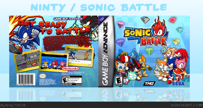
I like how theres a good assortment of characters on the front, and how you've arranged them in away that works. Most sonic boxes just have a character or two on the front. I also really like the warped text on the back.
It's very colorful and definitely feels like a Sonic product.
awesome. colorful, flawless. That description on the back is detailed and accurate. like #11 said, usually there's just sonic on the front, maybe tails or knuckles in the background. but you used a bunch of characters and organized them by their alignment. Perfect, and favorited.
 Sonic Battle Box Cover Comments
Temp cred to ADFD,
Anyways view in full and enjoy.
[ Reply ]
i dont like the BG you used and you should have used the same color for all the text
BTW check your PMs
Edited at 1 decade ago
[ Reply ]
Hot damn!
[ Reply ]
#1, cred solardestruction for the emeralds.
[ Reply ]
I really like the composition, the GBA temp is too wide.
[ Reply ]
#4, it's really no big deal to me. I actually found them on google, but didn't know who to credit for them.
[ Reply ]
#6, I found them on Google too, and thanks for the comments everyone.
[ Reply ]
The back is really cool (love the screen borders) but im just not feeling the front. I dont know why, its like something is missing but I cant think what. Still, the overall box looks great 4/5
[ Reply ]
I actually liked this game.
[ Reply ]
i really like this. brings out the fun of the game
[ Reply ]
I agree with all the positive comments.
I like how theres a good assortment of characters on the front, and how you've arranged them in away that works. Most sonic boxes just have a character or two on the front. I also really like the warped text on the back.
It's very colorful and definitely feels like a Sonic product.
Edited at 1 decade ago
[ Reply ]
awesome. colorful, flawless. That description on the back is detailed and accurate. like #11 said, usually there's just sonic on the front, maybe tails or knuckles in the background. but you used a bunch of characters and organized them by their alignment. Perfect, and favorited.
[ Reply ]