Well thought out box but a few suggestions
- Capcom logo wayyyy to huge
- The low opacity characters on front just dont work well... and the plain backround is okay but needed more.
- The txt on the back dosnt align well with the screenshots and it's hard to read, you dont always need a stroke to make it look fancy.
- Screens are kewl but you need more space for it, they are to small.
Anyways that's all a very well thought out box though. Love your work
 Apollo Justice : Ace Attorney Box Cover Comments
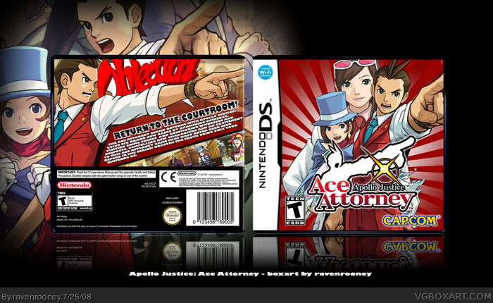
Apollo Justice. Credit temp to KoopaDasher, I believe.
[ Reply ]
Marvelous, flawless, excellent.
Edited at 1 decade ago
[ Reply ]
Well thought out box but a few suggestions
- Capcom logo wayyyy to huge
- The low opacity characters on front just dont work well... and the plain backround is okay but needed more.
- The txt on the back dosnt align well with the screenshots and it's hard to read, you dont always need a stroke to make it look fancy.
- Screens are kewl but you need more space for it, they are to small.
Anyways that's all a very well thought out box though. Love your work
[ Reply ]
#3, Spot on, still a good box.
[ Reply ]
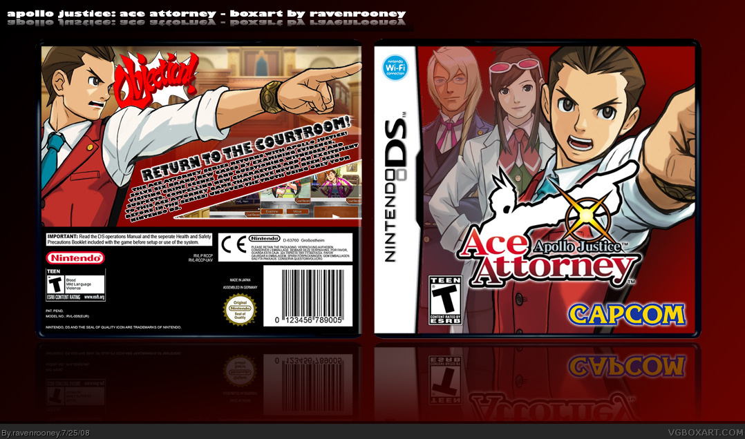
Updated to v2. Changed up the front, the screen shots have been changed, and the 'objection!' is larger.
Suggestions?
[ Reply ]
Err, I'd say replace Ema with someone of more importance. I'd say Phoenix.
[ Reply ]
Glad you updated, much better, next time for a box try not to focus so much on a character on the back that's what the front is for but fav
[ Reply ]
Fantastic. I love the back.
[ Reply ]
a m a z i n g FAVE AUTHOR FAVE
[ Reply ]
Thanks everyone for the favs!
[ Reply ]
I think get rid of Ema. If you do that, I'll fave it! =)
[ Reply ]