Well Shadow just seems to be randomly floating lol. Everything seems to be cut out nicely though which is refreshing for a box like this. The ESRB should be a bit bigger and the Sega logo would look better with a white outline. You sorta remind me of me when I first started out, I saw this background and placed it on my 2nd box with some really blurry Chao images haha. Anyway this is ALOT better than my 2nd box so nice job =) 3.5/5
I seriously plan on updating this box probably tomorrow night. This was a WIP that I just had to upload right away because I was fan-girling it way too much XD
 Shadow the Hedgehog Box Cover Comments
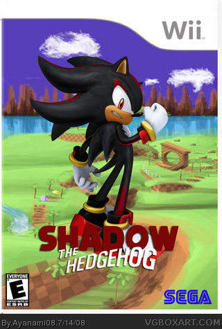
Shadow...with a twist!
I didn't clean up my work the best I could have (I can see the few stray pixels here and there..
But I love this to death. So I share it with you!
And BTW...chose the Wii...because I has a Wii..call it brand loyalty XD
[ Reply ]
Well Shadow just seems to be randomly floating lol. Everything seems to be cut out nicely though which is refreshing for a box like this. The ESRB should be a bit bigger and the Sega logo would look better with a white outline. You sorta remind me of me when I first started out, I saw this background and placed it on my 2nd box with some really blurry Chao images haha. Anyway this is ALOT better than my 2nd box so nice job =) 3.5/5
[ Reply ]
:) thank you Cerium!
I seriously plan on updating this box probably tomorrow night. This was a WIP that I just had to upload right away because I was fan-girling it way too much XD
I couldn't find the right spot to put Shadow....
Thanks for your input! :D
[ Reply ]
the logo has a feel that is good. Try shrinking down Shadow And putting him somewhere else, or use a different render.
[ Reply ]