In full I noticed the writing is a little off, making a larger version to fix that
Edit: Actually, just view the printable, its as clear as day on that.
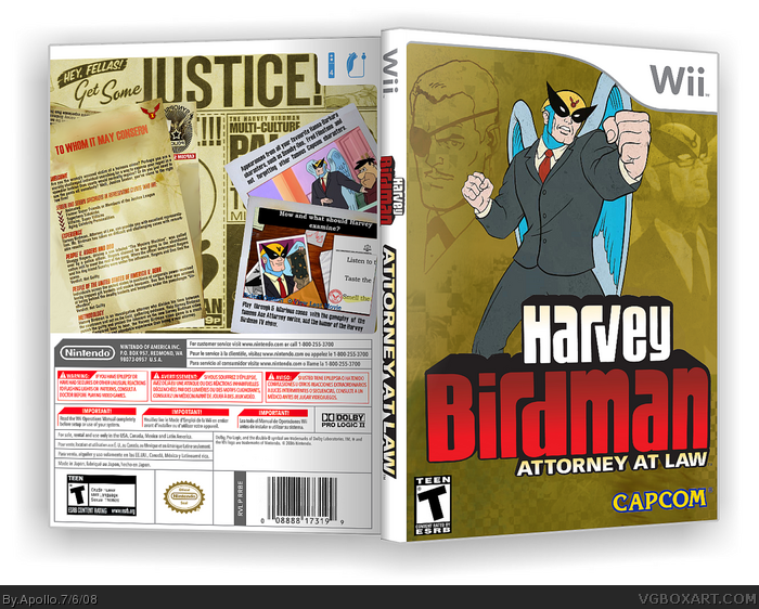
This is great. I agree that the white on the front doesn't flow with the back very well. I think you could have just left him normal and this box would have been one of the best I've seen.
 Harvey Birdman: Attorney at Law Box Cover Comments
My greatest box yet, IMO.
Don't you dare not comment.
[ Reply ]
That is fantastic! +Fav
[ Reply ]
Thanks!
In full I noticed the writing is a little off, making a larger version to fix that
Edit: Actually, just view the printable, its as clear as day on that.
Edited at 1 decade ago
[ Reply ]
Agreed. It's simply marvelous. +fav
[ Reply ]
I don't like the way you have Birdman on the front, with the white over him, but the back is amazing.
[ Reply ]
#5 Take off of the Ace Attorney Logo
link
[ Reply ]
This is great. I agree that the white on the front doesn't flow with the back very well. I think you could have just left him normal and this box would have been one of the best I've seen.
BUt you get a fav anyway.
[ Reply ]
Awesome.
[ Reply ]
Its great man, 5/5
[ Reply ]
Thanks guys, it was nice to get this many comments and faves :D
[ Reply ]
#6, sorry, but that doesn't really look good at all there... =/
But the rest is fantastic! +Fav for the back.
[ Reply ]
i really, REALLY dislike the white birdman thingy on the front.
doesn't feel part of the logo..
back=pure win.
Edited at 1 decade ago
[ Reply ]
The logo shall be fixed.
TO GIMP!
Edit: There, now just gotta upload the printable
Edited at 1 decade ago
[ Reply ]
No-one cares about the update? >_>
[ Reply ]
#14, looks better now ^^
[ Reply ]
Much better.
[ Reply ]
This had a better run then I thought... Time to make another box!
[ Reply ]
Good job
[ Reply ]