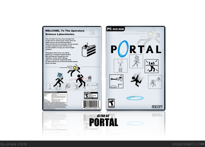
Awesome, but I realized something (not whether if it's intentional or not): the icons on the front aren't exactly aligned, and the repeated image isn't necessary, but damn, you really captured the fell to the game. Major improvement over your other work. Well done.
 Portal Box Cover Comments
Hey, this is pretty nice.
[ Reply ]
very nice actually :) +fav
[ Reply ]
Perfect! :D
+fav
[ Reply ]
good job
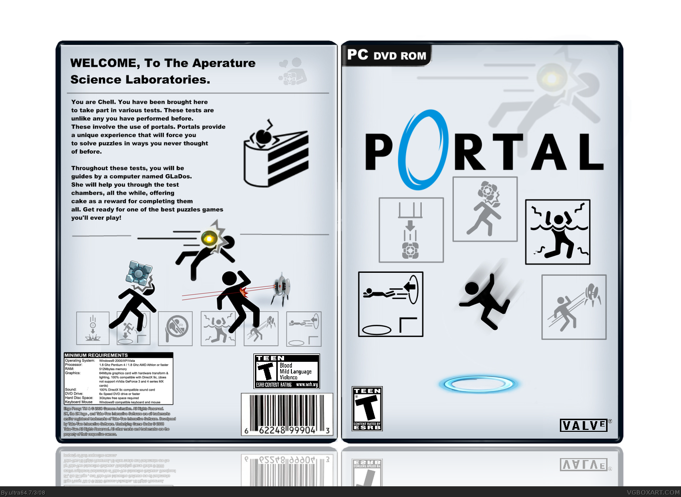
clean and simple, just like portal
[ Reply ]
Thats... surprisingly flawless. :)
[ Reply ]
I wish there were screen shots of the real game.
[ Reply ]
Forgot to comment earlier. It's fantastic.
[ Reply ]
#6, I disagree, the box would lose it's purpose.
[ Reply ]
#8, Agreed.
The whole minimalistic design would be ruined.
[ Reply ]
Great design and composition.
[ Reply ]
The cake is a lie!
[ Reply ]
Awesome, but I realized something (not whether if it's intentional or not): the icons on the front aren't exactly aligned, and the repeated image isn't necessary, but damn, you really captured the fell to the game. Major improvement over your other work. Well done.
Edited at 1 decade ago
[ Reply ]
Thanks everyone for the comments and favs!!!
[ Reply ]
One question: Do you have experience graphic design? 'Cuz this is great.
[ Reply ]
xP I like the simple-ness.
[ Reply ]
#14 lol no
#15 thx, that was what I was trying to do.
[ Reply ]
Very pretty :D
[ Reply ]
Arial Black sucks!!! But the box is pretty nice! :D
[ Reply ]
#18, um... Thanks?
[ Reply ]