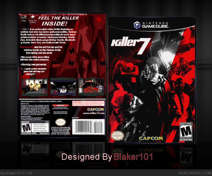
I know its another Killer 7 box but,
I really wanted to make one. I'm very
happy how this came out.
Credit LK for the temp and Nikki for
the screen borders. LK, Elcrazy, and
Ayron for inspiration
It's really nice, but I hate how everyone's making a Killer7 box now. Anyways, the box is supoib, but the contrasting art is a bit offsetting, the text is a bit odd, and the screen shot borders don't fit the game.
I'm kinda surprised that you put some butterflies on the back like I did. You don't really see them a whole lot in the game, (maybe once in a puzzle) But I did that for mine to separate it from the others, as well as a being a cool stylistic choice. Also as qwerty mentioned, "destroyed" doesn't really fit in as a signature for any box really- it has to make sense too in terms of design. (which is why I labeled mine as "executed")
Everything else looks great, I like the design choices you made for both front and back. Well done. ;)
#16- Haha, just messing with you. As LK said, it doesn't make much sense. If it was, like, the "Opposite Box" it would work. XD
#19- Hmm.. I wouldn't quite say that it's reminiscent of Ladykiller's, but rather a fusion of Ayron's and ELCrazy's, which is definately not a bad thing. It's crisp, dark, and comic-book-ish.
You do have a sense of style, Blaker101, but I really like to see it in action. I've realized that boxes you've created, like this one, Splinter Cell: Conviction, and even Dead Space, are near-carbon copies of ones that were created previously. Not saying that it's a bad thing, but it's definitely not a good thing, as it does not show the original side of you.
This is definitely an interesting cover.
The minor edits that you made to the front cover art are nice, the monochrome red fits better with the rest of the graphics IMHO.
Though the borders around the screenshots look a bit out of place to me.
All in all, this is a pretty awesome boxart.
BTW, I'm quite sure that Edwin David would appreciate it if you gave him credit for creating the art that you used for the front cover of this piece.
#17, The art used was made for a comicbook cover, though I don't think that it was ever officially printed. link
 Killer 7 Box Cover Comments
Seconds, anyone?
[ Reply ]
Inspired by ElCrazy and LadyKiller I see
#3 yea, Ayron too
Edited at 1 decade ago
[ Reply ]
Now that's what I call a box. Your best box yet. +fav
#2 and Ayron.
Edited at 1 decade ago
[ Reply ]
I know its another Killer 7 box but,
I really wanted to make one. I'm very
happy how this came out.
Credit LK for the temp and Nikki for
the screen borders. LK, Elcrazy, and
Ayron for inspiration
Comments and Favs are welcome, Enjoy!
Edited at 1 decade ago
[ Reply ]
It's really nice, but I hate how everyone's making a Killer7 box now. Anyways, the box is supoib, but the contrasting art is a bit offsetting, the text is a bit odd, and the screen shot borders don't fit the game.
[ Reply ]
This is really cool, the image quality could be much better on the front and the back of the template. I'll author fav you though.
[ Reply ]
#5, Me too.
#6, I agree.
[ Reply ]
Sweet yuh posted it.
[ Reply ]
luv it
[ Reply ]
I see, so you destroyed the box, but you didn't make it.
[ Reply ]
#10, ummmm... what?
#12, WTF o_O
Edited at 1 decade ago
[ Reply ]
#11, ummmm... Look under the box.
[ Reply ]
#12, I was gonna say that exact same thing.
[ Reply ]
Wow a Killer 7 box, how rare these days :) Beautifully done.
[ Reply ]
I'm kinda surprised that you put some butterflies on the back like I did. You don't really see them a whole lot in the game, (maybe once in a puzzle) But I did that for mine to separate it from the others, as well as a being a cool stylistic choice. Also as qwerty mentioned, "destroyed" doesn't really fit in as a signature for any box really- it has to make sense too in terms of design. (which is why I labeled mine as "executed")
Everything else looks great, I like the design choices you made for both front and back. Well done. ;)
[ Reply ]
#10, I did make this box I will update the bottom text.
[ Reply ]
#15, Not entirely true, "Destroyed" would defiantly fit a Guilty Gear box. :3
Is the art you used for the front official art or fan art? I don't think I've seen it before.
[ Reply ]
#17, It is true. Either way, the respective artist didn't "destroy" it, he made it.
Putting anything that's the direct opposite of any word synonymous with "created" would be just nonsensical, when you think about it.
[ Reply ]
wonderful box although a bit reminiscent of LadyKiller's
[ Reply ]
#16- Haha, just messing with you. As LK said, it doesn't make much sense. If it was, like, the "Opposite Box" it would work. XD
#19- Hmm.. I wouldn't quite say that it's reminiscent of Ladykiller's, but rather a fusion of Ayron's and ELCrazy's, which is definately not a bad thing. It's crisp, dark, and comic-book-ish.
Edited at 1 decade ago
[ Reply ]
#13, gratz on rank 6 dude. and nice box Blaker.
Edited at 1 decade ago
[ Reply ]
Pretty kool, Similar style to the other recent Killer7 boxes but clean and crisp.
[ Reply ]
Updated, I fixed the text at the bottom.
[ Reply ]
You do have a sense of style, Blaker101, but I really like to see it in action. I've realized that boxes you've created, like this one, Splinter Cell: Conviction, and even Dead Space, are near-carbon copies of ones that were created previously. Not saying that it's a bad thing, but it's definitely not a good thing, as it does not show the original side of you.
So, Blaker, show us what you're made of! ;)
[ Reply ]
This is definitely an interesting cover.
The minor edits that you made to the front cover art are nice, the monochrome red fits better with the rest of the graphics IMHO.
Though the borders around the screenshots look a bit out of place to me.
All in all, this is a pretty awesome boxart.
BTW, I'm quite sure that Edwin David would appreciate it if you gave him credit for creating the art that you used for the front cover of this piece.
#17, The art used was made for a comicbook cover, though I don't think that it was ever officially printed.
link
Edited at 1 decade ago
[ Reply ]