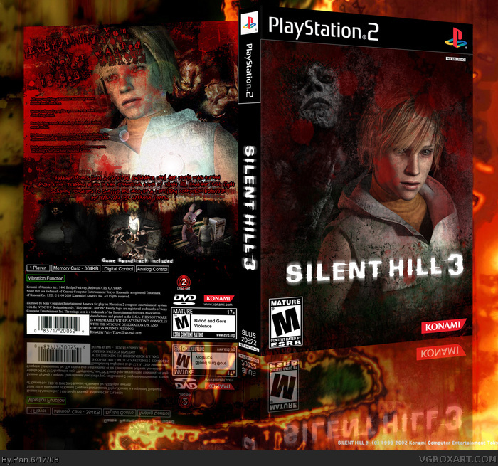
Ok, so this was my box for Mugglesman111s competition, however I made two versions of this box, the normal one for the site and one with "game of the year" info for the comp.
I'm not at home now though, so I only have this version to upload. I'll be sure to upload the version without GOTY info as well as a printable version as soon as I get home. :3
Until then please comment, and note that I fixed the typo "mSubway" on the other version already.
#4, oh, just that it's red text on a red BG. maybe white text or outer glow would do...
and yes, you also noticed it... people on this site pay tragically little attention to new artists or artists below 7 red dots... a little attention once in a while would be nice. especially when the box is as great as yours is and deserves much more attention than it gets.
I knew people were probably going to dislike the text on the back when I was making it,yellow/brownish text like on the official showed up better but didn't look as good.
I guess I just liked the red on red look, I tried white text too but colors other than red kinda ruin the feel.
 Silent Hill 3 Box Cover Comments
Ok, so this was my box for Mugglesman111s competition, however I made two versions of this box, the normal one for the site and one with "game of the year" info for the comp.
I'm not at home now though, so I only have this version to upload. I'll be sure to upload the version without GOTY info as well as a printable version as soon as I get home. :3
Until then please comment, and note that I fixed the typo "mSubway" on the other version already.
Edited at 1 decade ago
[ Reply ]
Marvelous.
[ Reply ]
UH-OH, such a tiny little step from being above perfect!!!
the letters at the back are nearly invisible.
fav anyway :)
[ Reply ]
#3, Where at?
[ Reply ]
perfect
[ Reply ]
Updated with the proper version, as well as the 300 DPI printable.
Also, not to be a bitch or anything but some more comments would be nice, I don't make boxes for attention but it's still nice.
[ Reply ]
Wow very grungy, not a fan of the txt wish it was more apparent
[ Reply ]
#4, oh, just that it's red text on a red BG. maybe white text or outer glow would do...
and yes, you also noticed it... people on this site pay tragically little attention to new artists or artists below 7 red dots... a little attention once in a while would be nice. especially when the box is as great as yours is and deserves much more attention than it gets.
Edited at 1 decade ago
[ Reply ]
I knew people were probably going to dislike the text on the back when I was making it,yellow/brownish text like on the official showed up better but didn't look as good.
I guess I just liked the red on red look, I tried white text too but colors other than red kinda ruin the feel.
Edited at 1 decade ago
[ Reply ]
#9, oh, is that so...
then what about a white outer glow? the text wouldn'y lose the "feling" and would be much more visible :)
[ Reply ]
First impression: 2.4/3
Effort: 3.8/4
Details and finetuning: 2.5/3
Total: 8.7
[ Reply ]
First impression: 2.4/3
Effort: 3.8/4
Details and finetuning: 2.5/3
Total: 8.7
[ Reply ]