![]() »
»
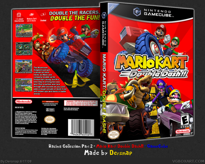
[ Box updated on June 17th, 2008 ] [ original ]
 Mario Kart: Double Dash!! Box Cover Comments
Comment on Dersnap's Mario Kart: Double Dash!! Box Art / Cover.
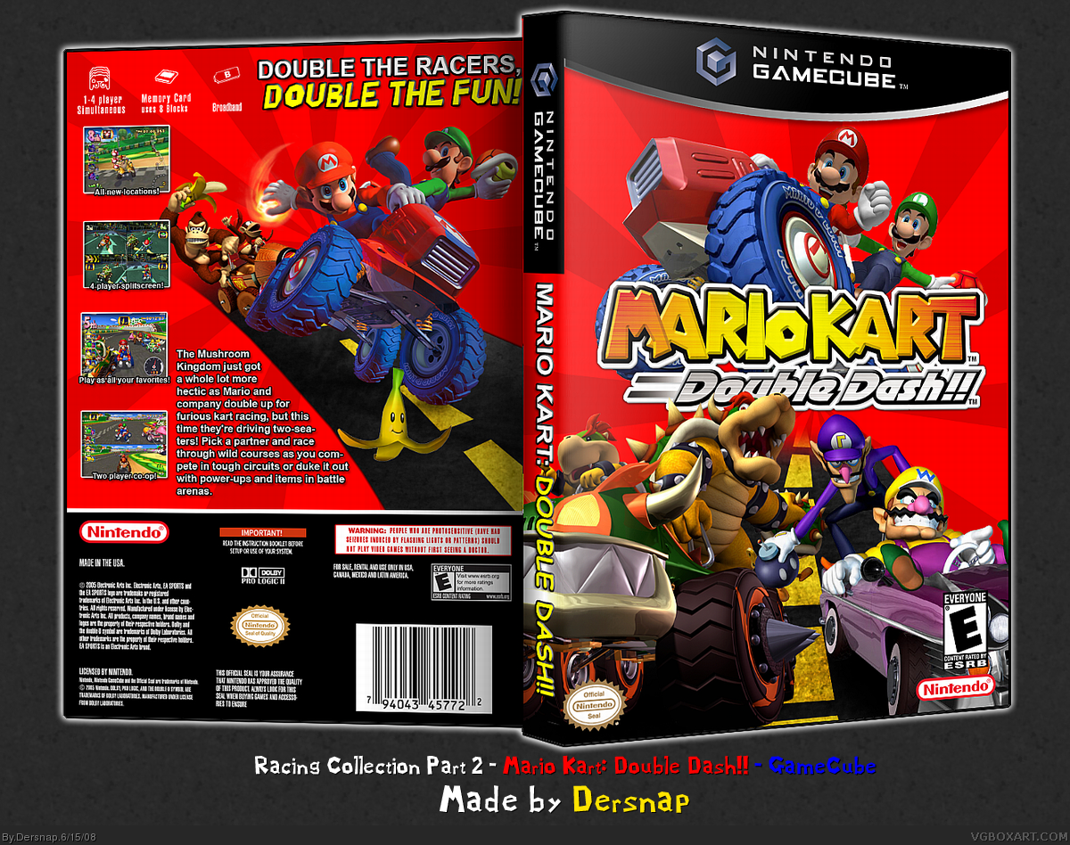
Well, here it is. The second and final part to my Racing Collection.
This one was a killer, but it was also very fun to make. I'll add a printable later. ;]
If you view/favorite, please don't be a lazy ass, make a comment.
Edited at 1 decade ago
[ Reply ]
Different, I love it! :D
+fav
[ Reply ]
Looks even better than on MNS.
Speaking of that, get on, nao.
Wow no attention, FTW???
Edited at 1 decade ago
[ Reply ]
The screen shots on the back are small and hard to see, and there is no "only for" on the GC template. Other than that I can't say it looks bad, it's pretty nice.
[ Reply ]
Thanks guys, but it kinda pisses me off that some of you were too lazy to comment. :\
Printable added.
[ Reply ]
#5, Whats up with yo MSN are you online? It says you're off
[/Breaking teh rulez]
[ Reply ]
What I don't like is that you have Mario and Luigi both on the front and back. There is more characters, there is a variety of characters. I know it's not a repeat image, but it doesn't look good. On the back, I'd say put Peach and Daisy instead of Mario and Luigi since they're already on the front. Good eb=nough to fav though +fav
[ Reply ]
I take back what I said about the screens, they look nicer on the printable. I would suggest re typing the legal info on the back bigger so it would look nicer though, just a suggestion.
[ Reply ]
link
[ Reply ]
#9, Shut the fuck up. You're not funny, so stop trying. Anyways, didn't you upload this yesterday or something? I'm positive I've seen this before today...
[ Reply ]
#10, yeah, I did. But I got a bunch of comments from people telling me to fix some stuff, so I just removed it until I'd fixed it all.
And thanks to everyone who gave me crits and comments, and faves. ;]
[ Reply ]
IZ NICE! ^_^
[ Reply ]
sweet
[ Reply ]
Kick-ass ^_^
[ Reply ]
awesome
[ Reply ]
#12, Yay ^_^
#13, Thanks
#14, Woo!
#15, Thank you, kind sir. ^________^
And thank to everyone who didn't take the time to comment, but favorite. ^-^
Oh! Almost forgot...BUMP.
Edited at 1 decade ago
[ Reply ]
best mario kart double dash box, but needed a "Only for" logo.
5/5 +fav.
[ Reply ]
Alright, well, you guys asked for it, so here it is! The updated version WITH the "Only For" logo on it.
Enjoy. ;]
[ Reply ]
Missed this one..
Looks great.
[ Reply ]
your box is totally great!
But i think that you should move the E logo on the front cover to the bottom left.
[ Reply ]
SWEET!6/5
[ Reply ]
its allready a proper game you stupid wally
[ Reply ]
I really like it. Very well done! Faved!
[ Reply ]