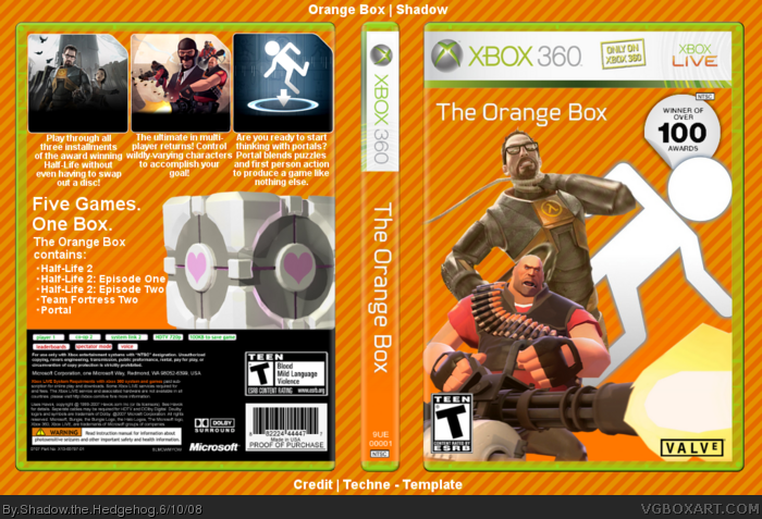
Front is way too plain, and not in a minimalistic way. It needs renders. Also, use a different background behind the box. It looks like you forgot to cut off the background outside the box.
yeah, i'm sorry. the front is just bland. i know it's minimalism, but a blank cover with practically nothing on it is just boring. it's really hurting my eyes how everything blends in with the canvas, it makes it seem like you put a template on TOP of the background.
Anyway, why is everyone being so bitchy? Jeez, could you guys please chill a little? And the presentation shouldn't really matter...please look at the box.
Now I shall address everybody:
#1: Ok.
#3: Updated.
#4: Ok. I'm not trying to make anything drastically new, just a clean box that I can use in the first round in the Milky comp <_<
#5: It's a wallpaper I made :p
#6: Erm...I don't think that really matters, nor does anyone really care <_<
#8: Check update please <_<
#9: Thanks :p
The fact that the background is the canvas really pisses me off. The renders are unattractively placed, and the back text looks bad. I have to say, I expected more from you. 2/5
#11, Ok, I'm just trying to get past a first round
#12, Ok, I don't like the renders myself, check version 1. But if people say it needs it, so be it. sorry I dissapointed you.
 The Orange Box Box Cover Comments
Wow. Umm, that front ia far too plain. Sorry.
Edited at 1 decade ago
[ Reply ]
If you're gonna say "Oh, the front's not finished, blah blah," it is. I was going for minimalism.
EDIT: #1, -_-
Edited at 1 decade ago
[ Reply ]
Front is way too plain, and not in a minimalistic way. It needs renders. Also, use a different background behind the box. It looks like you forgot to cut off the background outside the box.
[ Reply ]
It's not really that the front is far too plain, it's that the background is the same behind the box which really looks terrible.
As for the back, it's basically just a render, text and three "sreenshots". Nothing new.
Edited at 1 decade ago
[ Reply ]
yeah, i'm sorry. the front is just bland. i know it's minimalism, but a blank cover with practically nothing on it is just boring. it's really hurting my eyes how everything blends in with the canvas, it makes it seem like you put a template on TOP of the background.
[ Reply ]
By the way, it's Team Fortress "2" not Team Fortress "Two".
[ Reply ]
Hey look, characters <_<
Anyway, why is everyone being so bitchy? Jeez, could you guys please chill a little? And the presentation shouldn't really matter...please look at the box.
Edited at 1 decade ago
[ Reply ]
lool we love to be bicthy!! :D better now
Edited at 1 decade ago
[ Reply ]
i like it. Now that you have added renders it looks much better, and I actually like the back. +fav
[ Reply ]
Now I shall address everybody:
#1: Ok.
#3: Updated.
#4: Ok. I'm not trying to make anything drastically new, just a clean box that I can use in the first round in the Milky comp <_<
#5: It's a wallpaper I made :p
#6: Erm...I don't think that really matters, nor does anyone really care <_<
#8: Check update please <_<
#9: Thanks :p
[ Reply ]
Sorry shadow but obviously not your best work. I just don't like it :/
[ Reply ]
The fact that the background is the canvas really pisses me off. The renders are unattractively placed, and the back text looks bad. I have to say, I expected more from you. 2/5
[ Reply ]
#11, Ok, I'm just trying to get past a first round
#12, Ok, I don't like the renders myself, check version 1. But if people say it needs it, so be it. sorry I dissapointed you.
[ Reply ]
i dont like how the guy is being choked on the front, too graphic in my opinion
[ Reply ]
not bad, not bad at all... except for the gordon freeman render... i think it should be something a little more calm...
otherwise great!
[ Reply ]
#14, I'll think about it. I really don't feel like updating this box <_<
#15, thanks man
[ Reply ]