I seriously can't believe this, but I'm not faving. =O
It just doesn't blend good. Yeah, it's supposed to be weird, but still... and I dislike the practically plain yeloow back.
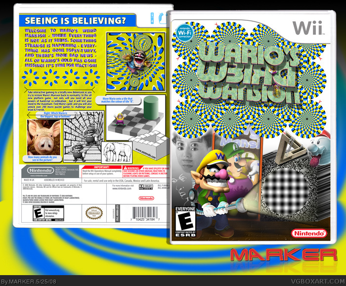
!!!WARNING!!! LOOKING AT THIS FOR A LONG TIME COULD GIVE YOU HEADACHE!!
Well.. this is something I've being meaning to do for a while.. and at last made it. It's not the best design, but I just wanted to make a totally crazy box from the norm. I took about an hour just to figure out and write the back text so that it waves around ;) Well.. hope you like... and it's my first 2D presented box because it HAD to be ;)
Essential to view in Full!! And read warning, as had I couldn't work on this box for a few hours because the wavy text and images would give be a headache!!
..and thanks to Cerium for a couple of the optical illusions suggestions ;)
#14, lol -- it's quite tricky to write the text. Basically...
1. Write a block of text in one colour.
2. Now create a layer above it with diagonal lines.. say 8-10 diagonals.. use this only as a template.
3. Each diagonal section of your text will have a different black and white dropshadow. Since the dropshadows appear top-left, then top right, bottom-right, and bottom-left.. you will have to change the dropshadows for every four diagonal sections.
4. SO, for all the letters in the 1st, 5th, 9th diagonal sections.. add a white dropshadow in top-left (2px up, 2px left) and a black dropshadow botton-right (2px down, 2px-right) -- basically opposite.
5. Then do the same for 2nd, 6th, 10th diagonal sections, but white drop-shadow in topright and black bottomleft..
6. And Continue with the next 2 sections... alternating.. and you'll have a wavy text! ;)
I actually copied the original, changed the colour, shifted them underneath, and with a layer mask, deleted the ones I don't want... and repeat.
dude that's awsome.
I especailly like it because we did a whole bunch of optical illusions in school recently
I would have put in one of those illusions that if you stare at it long enough unfocused this picture turns into a 3-D thing.
#22, You mean a Magic Eye image? I did considering putting one in.. but it would have to be big, and would take up half of the box.. and I doubt people would be starring at the box to try to see the 3D image... especially as some people are getting a headache just by a quick glimpse! LOL
And Thanks for all the comments/FAV'ed ---- and my apologies if you got a headache by looking at it --- I did give a warning at the top --- and imagine me making it for the past 3 days!! Pass me the asprin!! lol
#21, ROFL :) Bullseye.
This is a funny box, but it's not what I like and what I usualy fav. It's not about design :) So, sorry, m8, but I will skip this time :)
I am sure that this box could have a lot more favs if it was uploaded by some less titled artist, cos a lot of ppl waits some incredible design from MARKER. IMO
Nicely done. We recently were doing Corel and Photoshop Optical Illusions in computer studies, so I recognize the pictures (minus the pig.) Well done sire, and I added you to my favourites.
woh....if you look at it the circles on the front seem to go around and around (at logo). and the flowerish circles go round and round on the back! And same for the part where the writing is on the back!
5/5 and definitely faved! Never seen a boxart like it! How'd you do it?
they wouldn't be able to make a real cover like this because it would give kids sezuires (or however you spell that) like that one pokemon episode with pikachu's thunder shock.
 Wario's Weird Mansion Box Cover Comments
I seriously can't believe this, but I'm not faving. =O
It just doesn't blend good. Yeah, it's supposed to be weird, but still... and I dislike the practically plain yeloow back.
[ Reply ]
!!!WARNING!!! LOOKING AT THIS FOR A LONG TIME COULD GIVE YOU HEADACHE!!
Well.. this is something I've being meaning to do for a while.. and at last made it. It's not the best design, but I just wanted to make a totally crazy box from the norm. I took about an hour just to figure out and write the back text so that it waves around ;) Well.. hope you like... and it's my first 2D presented box because it HAD to be ;)
Essential to view in Full!! And read warning, as had I couldn't work on this box for a few hours because the wavy text and images would give be a headache!!
..and thanks to Cerium for a couple of the optical illusions suggestions ;)
Edited at 1 decade ago
[ Reply ]
Ouch charlie, my head.
Edited at 1 decade ago
[ Reply ]
Nermind my first post, I forgot to do full. Now I see the greatness! Wonderful job with the opticaly illusions!
[ Reply ]
WOw!! Thats all I can say...
I just hope EVERYONE looks at this in full view before commenting!!!
[ Reply ]
Interesting..... Wasnt expecting this from MARKER but it's awesome so I'll fave. :D
Your right it does give you a headache :D
[ Reply ]
Holy crap, it's not 3D. o________O
[ Reply ]
This is pure ownage :D
[ Reply ]
This really ownage...that's all I can say about it.
[ Reply ]
this is awesome
[ Reply ]
it creeps me out is the text moving when you look at it in full view?aaarghhhh awsome
Edited at 1 decade ago
[ Reply ]
*Headaches* +fav
[ Reply ]
#7, I know, I thought the same thing...
I'm scared, johnny. o.O
[ Reply ]
how did you get the text to do that
[ Reply ]
#14, lol -- it's quite tricky to write the text. Basically...
1. Write a block of text in one colour.
2. Now create a layer above it with diagonal lines.. say 8-10 diagonals.. use this only as a template.
3. Each diagonal section of your text will have a different black and white dropshadow. Since the dropshadows appear top-left, then top right, bottom-right, and bottom-left.. you will have to change the dropshadows for every four diagonal sections.
4. SO, for all the letters in the 1st, 5th, 9th diagonal sections.. add a white dropshadow in top-left (2px up, 2px left) and a black dropshadow botton-right (2px down, 2px-right) -- basically opposite.
5. Then do the same for 2nd, 6th, 10th diagonal sections, but white drop-shadow in topright and black bottomleft..
6. And Continue with the next 2 sections... alternating.. and you'll have a wavy text! ;)
I actually copied the original, changed the colour, shifted them underneath, and with a layer mask, deleted the ones I don't want... and repeat.
Edited at 1 decade ago
[ Reply ]
Oh my.. um, very good work. 5/5 (Sorry, no Fav; headache).
I actually covered my eyes when I scrolled to the top of the page.
Edited at 1 decade ago
[ Reply ]
I'm not gonna favorite it cause it gave me a headache... but other than it blinding me, it is great. :D
Edited at 1 decade ago
[ Reply ]
Sick box
[ Reply ]
I love this, even though yellow is one of my least favorite colors. fav.
[ Reply ]
I actually really don't like this...
But it's cool how almost everything moves :P
Edited at 1 decade ago
[ Reply ]
The fuck....? Is...is the box supposed to look like it's rippling? MARKER, my dear friend, you are SO on crack.
[ Reply ]
dude that's awsome.
I especailly like it because we did a whole bunch of optical illusions in school recently
I would have put in one of those illusions that if you stare at it long enough unfocused this picture turns into a 3-D thing.
Great Job on the Text.
[ Reply ]
#21, it's optical illusions...
[ Reply ]
#22, You mean a Magic Eye image? I did considering putting one in.. but it would have to be big, and would take up half of the box.. and I doubt people would be starring at the box to try to see the 3D image... especially as some people are getting a headache just by a quick glimpse! LOL
And Thanks for all the comments/FAV'ed ---- and my apologies if you got a headache by looking at it --- I did give a warning at the top --- and imagine me making it for the past 3 days!! Pass me the asprin!! lol
Edited at 1 decade ago
[ Reply ]
I can't believe I'm saying this, but I don't like it. It's just too weird for me. It's not my type of box.
[ Reply ]
#21, ROFL :) Bullseye.
This is a funny box, but it's not what I like and what I usualy fav. It's not about design :) So, sorry, m8, but I will skip this time :)
I am sure that this box could have a lot more favs if it was uploaded by some less titled artist, cos a lot of ppl waits some incredible design from MARKER. IMO
[ Reply ]
This box is...wow.
[ Reply ]
You've certainly surprised me the most with this one, marker. I love all the optical illusions on there. **dizzy** ;)
[ Reply ]
Intersting concept. But shouldnt this be in humor? I mean it's funny, is it not?
Edited at 1 decade ago
[ Reply ]
It's so obvious your box will be good...
Try making a bad box!
Haha joking
[ Reply ]
Nicely done. We recently were doing Corel and Photoshop Optical Illusions in computer studies, so I recognize the pictures (minus the pig.) Well done sire, and I added you to my favourites.
[ Reply ]
#2, Ow.
[ Reply ]
good fave
[ Reply ]
weird... but effective and great experimentation.
[ Reply ]
How many animals am I supposed to see with the pig?
[ Reply ]
#35, Just 2 ;)
[ Reply ]
woh....if you look at it the circles on the front seem to go around and around (at logo). and the flowerish circles go round and round on the back! And same for the part where the writing is on the back!
5/5 and definitely faved! Never seen a boxart like it! How'd you do it?
[ Reply ]
they wouldn't be able to make a real cover like this because it would give kids sezuires (or however you spell that) like that one pokemon episode with pikachu's thunder shock.
[ Reply ]
bizarre, but i love it!!! +fav
[ Reply ]
This is the craziest box I've ever seen. I could have sworn those circles were just moving a second ago.
[ Reply ]
okay.... sooo this is humer link but not this box.
[ Reply ]
Once Again it is just pure awesomeness.
I cant wait to see if you make more.
Edited at 1 decade ago
[ Reply ]
Trippy, but awesome!
[ Reply ]
this is just too weird
[ Reply ]
0/10 horrible
[ Reply ]
#45, get bent
[ Reply ]
Haha! This is very twisted!
[ Reply ]
ow my heaf
[ Reply ]
this is a cool box.It hurts my head,but is still cool.
5/5
+fav
[ Reply ]
What the hell is up with the temp?
[ Reply ]
#50, what do you mean
[ Reply ]
man, I still look at this in awe.
[ Reply ]