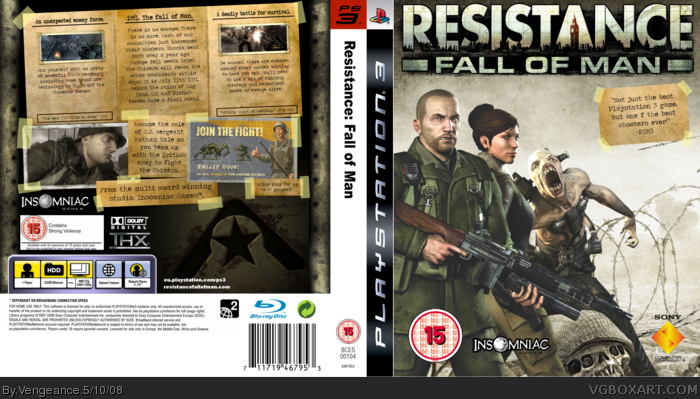
Ok, sorry I don't like it. Sony logo on the front is a little small, and the tape thing with the rating on it doesn't fit all that well. In the text also, it says "but one f the best shooters ever" it should say of, you left out the o in of. The back, im not too crazy over. I dont really like the noteswith the tape you did, i dont know i just dont like it all that much. sorry.
I sorta agree with #4 actually.
Im not too keen on this box at all. The back looks nice but the front just doesn't seem all that appealing. This box is good but its certainly not your best Greg. 3/5
#4, well, the game is set in the 1950's. it's not like i'm going to have shiny metallic surfaces going all over the place. old paper, sticky tape, typewrites, these were the kind of things people had in offices back then. The Sony logo is small? Yeah, well about 1 pixel, maybe. But it's about the same size as the 15 rating which it should be. And about that mispelling, it's a fucking typo. Jeez. Nothing to go kill yourself about. You people are acting way too harsh. A 3/5? seriously? I've seen Resistance boxes that are much worse than this and you're all like "OMGZORZ!!! FAV3!!"
#14, well yeah, but some tape, like tape in England, for example (in which this game is set) doesn't always have triangular edges. I think that kind of tape looks tacky anyway, it would kind of make the box look weird.
I would definitely say the back cover is the star of the show. Maybe if you had nathan and the lady in the center, and another character facing towards the left behind nathan (minus the Chimera and the skull), that might make the front more eye-catching too. ;)
The back is cool... real nice. As for the tape.. I think they are just too straight & clean, you should randomly "dirt" and rough up some of the edges. Have to agree with DMS on front.. Guy/Lady doesn't quite mix it up with Skull/Chimera IMO.
I wasn't being harsh with him at all. You're just trying to start an argument again aren't you. His points were not valid. He said the Sony logo is too small, and that's only a PETTY little mistake which is barely noticeable, and a typo that I had done on accident. He was going "oh I don't like it and all" because of a few tiny little things.
Back is AMAZING, but the front leaves the impression that you put a lot more in the back. I don't really like the random use of the Chimera render, and that skull looks a little out of place. Anyways, I'll still fav, because that back is incredible.
yeah, well, i did start the back first. I had that whole idea in my head weeks prior to the box's creation. I was running out of inspiration for the front, so I kind of had to throw it together. I did spend a lot of time with the front as well, but the back literally took like 4 hours.
 Resistance: Fall of Man Box Cover Comments
yeah... massive amount of work into this. I spent about 6 hours solid working on it. I think it's my best yet.
[ Reply ]
Whoa.....
[ Reply ]
i like it, my personal need to this is 3d-ing or depth ;)
It looks soooo real ;)
[ Reply ]
Ok, sorry I don't like it. Sony logo on the front is a little small, and the tape thing with the rating on it doesn't fit all that well. In the text also, it says "but one f the best shooters ever" it should say of, you left out the o in of. The back, im not too crazy over. I dont really like the noteswith the tape you did, i dont know i just dont like it all that much. sorry.
[ Reply ]
Interesting...
[ Reply ]
Sweet.....back is awesome.
[ Reply ]
I sorta agree with #4 actually.
Im not too keen on this box at all. The back looks nice but the front just doesn't seem all that appealing. This box is good but its certainly not your best Greg. 3/5
[ Reply ]
awsome as alwys man, fav
[ Reply ]
#4, well, the game is set in the 1950's. it's not like i'm going to have shiny metallic surfaces going all over the place. old paper, sticky tape, typewrites, these were the kind of things people had in offices back then. The Sony logo is small? Yeah, well about 1 pixel, maybe. But it's about the same size as the 15 rating which it should be. And about that mispelling, it's a fucking typo. Jeez. Nothing to go kill yourself about. You people are acting way too harsh. A 3/5? seriously? I've seen Resistance boxes that are much worse than this and you're all like "OMGZORZ!!! FAV3!!"
Edited at 1 decade ago
[ Reply ]
#9 lolanyway what does zorz stand for?
[ Reply ]
Front looks a bit random to me, but by golly that back rules.
[ Reply ]
I love the back, but I'm not a fan of you having the skull and the Menial there. They don't fit in.
[ Reply ]
I especially like the back. Sweet work.
[ Reply ]
#13, i agree with that, the tape doesnt really look like tape though (maybe because it need the triangle edges)
[ Reply ]
#14, well yeah, but some tape, like tape in England, for example (in which this game is set) doesn't always have triangular edges. I think that kind of tape looks tacky anyway, it would kind of make the box look weird.
[ Reply ]
#15, :D yeah possibly
[ Reply ]
I would definitely say the back cover is the star of the show. Maybe if you had nathan and the lady in the center, and another character facing towards the left behind nathan (minus the Chimera and the skull), that might make the front more eye-catching too. ;)
[ Reply ]
The back is cool... real nice. As for the tape.. I think they are just too straight & clean, you should randomly "dirt" and rough up some of the edges. Have to agree with DMS on front.. Guy/Lady doesn't quite mix it up with Skull/Chimera IMO.
[ Reply ]
#9 You shouldn't be so harsh to Kirby22 just because he doesn't like your box. He made some valid points.
[ Reply ]
I wasn't being harsh with him at all. You're just trying to start an argument again aren't you. His points were not valid. He said the Sony logo is too small, and that's only a PETTY little mistake which is barely noticeable, and a typo that I had done on accident. He was going "oh I don't like it and all" because of a few tiny little things.
[ Reply ]
Back is AMAZING, but the front leaves the impression that you put a lot more in the back. I don't really like the random use of the Chimera render, and that skull looks a little out of place. Anyways, I'll still fav, because that back is incredible.
[ Reply ]
yeah, well, i did start the back first. I had that whole idea in my head weeks prior to the box's creation. I was running out of inspiration for the front, so I kind of had to throw it together. I did spend a lot of time with the front as well, but the back literally took like 4 hours.
[ Reply ]
back info is wrong. It is 1-4 players and supports 2-40 network
Also it doesn't support 1080 i or p.
Edited at 1 decade ago
[ Reply ]
I think that a rework for the front would be better. Maybe a more Limited Edition feel?
[ Reply ]
#23, ok, ok, no need to nitpick...
[ Reply ]