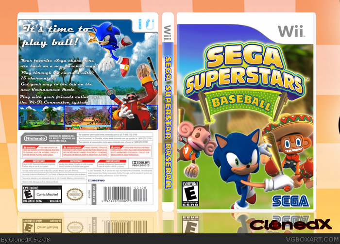
Why baseball? because i want to be original and have my own ideas and i love baseball. Logo by me and i edited the renders to.
Thanks Kirbylore for the bats of Sonic and monkey (dont know his name >.<) and to Cerium,IAMHUNTER, and Kirbylore for support. Koopadasher for the template
View on full please ;) C&C are welcomed
One last thing. Have i improved?
EDIT: #1 damn you xD
EDIT2: Sorry for the horrible satire i made back up, and I edited the temp a bit. #4 great comment over there -.-
You're improving. My only real problems with it are that the front is a little plain (more characters would fix that) the SEGA logo is a bit too big, and that the text on the back is a tad small and the font is difficult to read, and I think it should be moved up so there isn't so much blank space between the tagline and the text. Also the screen borders are a little boring, but it's not so bad.
The grass in the background is boringly emty. You should fill the background's grass with rings, bananas and other things. Other than that it is a very good box well done!
;____; Dude, I'm really sorry - I got your PM but didn't have time to respond to it and then forgot to do that later. :(
I like it a lot, shows wicked improvement and potential for you. You remind me of me when I was starting to get the hang of things. We both have/had the same problem - overall typography throughout the box.
#17 Maybe make the logo a little smaller or move it down a bit. Then if you could edit NiGHTS into holding a baseball bat and then stick him/her in the top left corner it would be really nice.
 Sega Superstars Baseball Box Cover Comments
Sega = Nintendo wannabe, jk nice job.
EDIT: Oh snap i beat you to first!
Edited at 1 decade ago
[ Reply ]
New idea = new box
Why baseball? because i want to be original and have my own ideas and i love baseball. Logo by me and i edited the renders to.
Thanks Kirbylore for the bats of Sonic and monkey (dont know his name >.<) and to Cerium,IAMHUNTER, and Kirbylore for support. Koopadasher for the template
View on full please ;) C&C are welcomed
One last thing. Have i improved?
EDIT: #1 damn you xD
EDIT2: Sorry for the horrible satire i made back up, and I edited the temp a bit. #4 great comment over there -.-
Edited at 1 decade ago
[ Reply ]
nice nice. +fav
[ Reply ]
"One last thing. Have i improved" oh, i think so.
[ Reply ]
if you ask me, this would be sooooooooo cooler tyhan tennis
[ Reply ]
You're improving. My only real problems with it are that the front is a little plain (more characters would fix that) the SEGA logo is a bit too big, and that the text on the back is a tad small and the font is difficult to read, and I think it should be moved up so there isn't so much blank space between the tagline and the text. Also the screen borders are a little boring, but it's not so bad.
[ Reply ]
#6 thanks, but it thought the SEGA logo was ok? Also, i dont know how to make good borders :/, and i will move the text up
thanks to everyone for C&F
and #2 you didnt faved -.-
Edited at 1 decade ago
[ Reply ]
#2, you're improving for sure, pretty good box by the way.
[ Reply ]
i actually really love it. nice job clonedx
[ Reply ]
Why is there a tennis net behind the word "BASEBALL"?
[ Reply ]
thanks #8 and #9
#10 it was part of the original logo, and i didnt knew a good baseball thing to replace it :/
EDIT: im updating tomorrow, im too tired now
Edited at 1 decade ago
[ Reply ]
Nice improvement. I really like it, I'm not enthusiastic about the fancy description text.
[ Reply ]
The grass in the background is boringly emty. You should fill the background's grass with rings, bananas and other things. Other than that it is a very good box well done!
Edited at 1 decade ago
[ Reply ]
cool, all there needs to be now are sss:basketball and golf lol ill fav
[ Reply ]
;____; Dude, I'm really sorry - I got your PM but didn't have time to respond to it and then forgot to do that later. :(
I like it a lot, shows wicked improvement and potential for you. You remind me of me when I was starting to get the hang of things. We both have/had the same problem - overall typography throughout the box.
Faved.
[ Reply ]
Its some great editing on the logo and the back looks cool!
4/5 +fav!!
your best box yet ^_^
[ Reply ]
thanks EG,IAMHUNTER,roza and Cerium
BTW! how do think i should update the front? adding more characters or putting rings and (bananas?) if so where?
Edited at 1 decade ago
[ Reply ]
#17 Maybe make the logo a little smaller or move it down a bit. Then if you could edit NiGHTS into holding a baseball bat and then stick him/her in the top left corner it would be really nice.
[ Reply ]
#18 you know, that is a GREAT idea :)
[ Reply ]
Add ToeJam and/or Earl, and then you get a fave!
[ Reply ]