![]() »
»
 Dirge of Cerberus: Final Fantasy VII Box Cover Comments
Comment on White_Dove's Dirge of Cerberus: Final Fantasy VII Box Art / Cover.
OH MY FREAKING GOD.
SEKSY
+FAVED
How'd you make that sleeve? P.M. me if you can =D
[ Reply ]
Oooh, I love the idea of having a transparent cover.
Awesomeness. :D
[ Reply ]
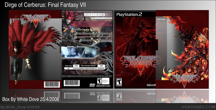
After strugling with so many games I finally managed to find one that I can have some idea for. This took 5 days to finish, I had to render everything in it, the logo, the images on the back and the images on the slips. yes, slips but these are the last I make I just had this idea and couldn't resist. The transperant space in the slips is a trasperant plastic. The back took ages to finish, I had so many ideas that I canceled and changed until I ended up with this. Front is plain, I know, but I didn't care much. I hope you like it guys. :)
Enjoy!
[ Reply ]
Great use of the artwork! Sorry, didn't mean to remove the fav, but I changed my comment because initially I was blown away, thinking you arranged the characters on the slip-cover, but saw that you didn't. There's nothing wrong with that AT ALL, and I know it must have been a bitch to render, but it didn't have as much as an impression after I realized. I state once again that there is NOTHING WRONG with using it, I just thought you did it yourself. But why are you saying you didn't use artwork? link
Edited at 1 decade ago
[ Reply ]
#4, This is artwork?? I thought artwork means art done by fans and not by the publishing company??? I get your meaning now. And I am sorry for asking you why you removed the fav. it is just I wouldn't have minded if you didn't fav in the first place but faving then removing it made me feel like I did something illegal.
Thanks for comments and favs so far, this box took ages to render everything and I am kinda proud of it... somehow.
Thanks DrDoomsday!
Edited at 1 decade ago
[ Reply ]
Wow, fantastic idea. I need to do something the same, LOL :D
The only thing that I don't realy understand and like it's this two horizontal red stripes.
+ Fav
[ Reply ]
even though i'm tired of slip cases, yours is so unique and awesome that it doesnt matter, i really love that you made the slip case part transparent too, im sure someone is going to copy you really soon (i hate that kinda crap) i also really love the way you did the slip case for the front, its just..WOW. the back one has some cutting problems but w/e. the box itself looks really limited edition too. love it all. +Fav/+Fav Author!
[ Reply ]
Looks great +fav
[ Reply ]
The transparent slip covers is a very cool and original idea.Even though I think slip covers are quickly becoming a gimmick to hide average boxarts, your box not only looks quite nice but the slip cover is so good that it proves that slip covers can be very interesting and original and stand on their own.
Also the proportions of most dev logos/temp seem fine.
Great job!
Edited at 1 decade ago
[ Reply ]
mmmm...lovely.
[ Reply ]
Very awesome, the transparent slip cover, ingenious
[ Reply ]
#1, check your Pms.
#6, The red strips are to hold the slip together cause the transperant part is not a solid plastic (it is a sort of plastic that doesn't stand by its own) so the strips are there to hold it stright. If you really DO make something similar to this I'd be pretty proud, honestly. xD
Everyone else thanks! glad this looked good. ^^
Thanks for all favs and comments.
[ Reply ]
I could've swore I posted a comment about this, I apologize for not doing so sooner.
I like it overall, but I have to admit, the one thing that made me favorite it is the clear slip cover, it's a wonderful idea that as far as I know hasn't been done at all. The only thing that would've made it better is to have a cover for it that goes with the slip cover to create a complete image.
[ Reply ]
Great idea.
Great execution.
Great box.
[ Reply ]
Wow. Just wow. Fav'd.
[ Reply ]
oO
Inovation!!!
[ Reply ]