#3, ... i hope that was sarcastic.
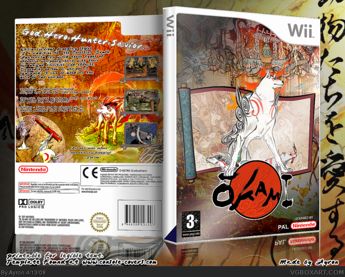
This is another attempt at trying to be creative-- it looks really small, will upload bigger version soon-- and i'll upload 2d[printable] to www.console-covers.com .
Thanks everyone ;)
p.s. #1, are you doing what i think you're doing??? SHOW YOUR HANDS!
#9, the text still pretty had to read in full size. I'll stop commenting on your boxes, this happens all the times I do. You don't acept MY criticisms, I just odn't really know why, but if you don't like me, tell me. I'm accustomed...
This is a very solid concept and use of artwork, but make sure you keep the contrast consistent. The front is too dull while the back is too burning.. somewhere in the middle of the two would look great.
This box is very aestetically appealling though, so I'll fav it. :)
Nice job, Aryon! =D
#26- Ah. Now I see. ^^ I love the idea of showing two sides of a game's theme on oppisite sides of the box.. very clever.
Sorry about spelling your name wrong.. =P
 Okami Box Cover Comments
Fap...fap...fap.
[ Reply ]
Is this game really coming out for Wii? Anyway, +fav
[ Reply ]
Nothing new.
[ Reply ]
#2, yeah. In like two days, I think.
This is amazing. +Fav
[ Reply ]
#3, ... i hope that was sarcastic.
This is another attempt at trying to be creative-- it looks really small, will upload bigger version soon-- and i'll upload 2d[printable] to www.console-covers.com .
Thanks everyone ;)
p.s. #1, are you doing what i think you're doing??? SHOW YOUR HANDS!
[ Reply ]
#5, Duhh if it was nothing new I wouldnt fav it.;)
[ Reply ]
#6, ok ;).
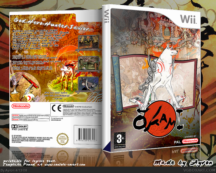
Update--better,bigger..stronger[?] version ;)
[ Reply ]
Make the screens bigger dude. And change your font, it's so hard to read...
[ Reply ]
#8, screens are big enough,and text is hard to read because of resizing,is that so hard to figure?
[ Reply ]
Yays! You made an Okami box. :D
[ Reply ]
Schwing.
[ Reply ]
#11, Wayne's World reference FTW?!
[ Reply ]
#9, the text still pretty had to read in full size. I'll stop commenting on your boxes, this happens all the times I do. You don't acept MY criticisms, I just odn't really know why, but if you don't like me, tell me. I'm accustomed...
[ Reply ]
#11, dang! I was gonna say that! :|
[ Reply ]
#13, you know what...go ahead. if you réally want to play the victim here, go ahead. I've got no problem with your criticism, as long as it makes sence.i mean,i already told you that the screen is hard to read due to resizing-- LOOK AT PRINTABLE ONCE IT'S UP AT WWW.CONSOLE-COVERS.COM ---
But honestly.. if you need to restrict yourself from commenting on my boxes. go ahead. that'd be the weakest thing.ever.
--thanks everyone ;)
[ Reply ]
o__O Why is there nothing on the spine? *demands answer*
[ Reply ]
#16, I agree, why is the spine blank?
Anyways, nice as always.
[ Reply ]
nice box +fav but yea i third that were is the spine?
[ Reply ]
I think that he forgot about the spine, happened to me too.
[ Reply ]
<spines suck>
anyway, great box my friend. very different from mine. is that what you were aiming for?! lol
[ Reply ]
It looks great.
[ Reply ]
It's very good. I just think that the back is much more contrast, while the front is just a tiny bit bland. Overall design is great though :)
[ Reply ]
Jaw-droppingly good!
[ Reply ]
This is a very solid concept and use of artwork, but make sure you keep the contrast consistent. The front is too dull while the back is too burning.. somewhere in the middle of the two would look great.
This box is very aestetically appealling though, so I'll fav it. :)
Nice job, Aryon! =D
[ Reply ]
nice
[ Reply ]
#24, i forgot to explain.. >.>"
To me,there are 2 "themes" or "sides" in both the art and the game.
1-"epic"- heroic art,positioning and actions-- wolf-savior,if you wish ;).
2- "distressed"- lonely and hopeless,again both in game and art...
That was exactly what i meant to show... front=#1,back=#2.
p.s. you misspelled my name
p.s.s. sorry about the spine >.>"
[ Reply ]
Looks good. Text on the backs kinda hard to read tho.
[ Reply ]
#26- Ah. Now I see. ^^ I love the idea of showing two sides of a game's theme on oppisite sides of the box.. very clever.
Sorry about spelling your name wrong.. =P
#1- Ewwwwwwwwwwwwwwwwwww.
[ Reply ]
Font on the back is to hard to read and the spine has no logo.
[ Reply ]
#29, >.>' why do some people don't pay attention?
HoF ftw.
[ Reply ]
#28, Silly rabbit. Anyways, grats on the HoF
[ Reply ]