![]() »
»
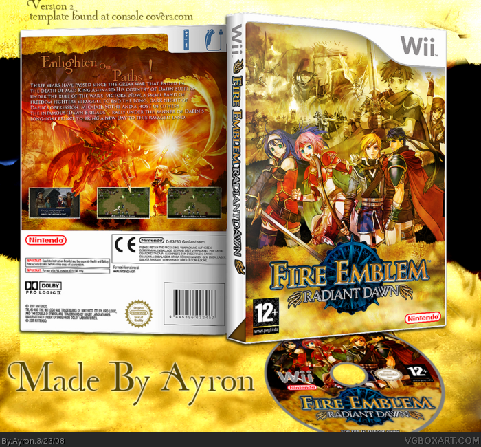
[ Box updated on March 23rd, 2008 ] [ original ]
 Fire Emblem: Radiant Dawn Box Cover Comments
Comment on Ayron's Fire Emblem: Radiant Dawn Box Art / Cover.
Here you go LK... a fire emblem box.
I know i used art from another FE game on the front.. but there was just so little
good/unused art for this game.. sorry, hardcore FE fans.
3d version up.. printable will be added soon.
Hope you like it ;)
[ Reply ]
Well everything is perfect...but the text on the back is hard to read but anyway this is a nice job!
[ Reply ]
I would have put the header on the back on top if the synopsis. It looks funnny where its at.
Otherwise, dayum.
[ Reply ]
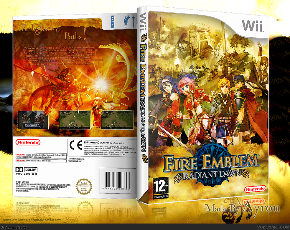
#2, that's because of the 3d version. everything is EASY to read on 2d printable version.
-edit- #3.. i know, but the header was too small.. it'd be really blurry...
Edited at 1 decade ago
[ Reply ]
I guess it's nice, but not your best. The back seems kinda plain.
[ Reply ]
nice, text is unreadable though, and screens are a tad small.
[ Reply ]
#5, hmm... well.. ok..
#6--i told you.. i'll upload printable.. [ if i can compress it somehow >.<]
-edit-
Printable is up..
those who cannot read the text--be so kind to look at the printable.
Edited at 1 decade ago
[ Reply ]
Nice box but it isn't my favourite from ye.
[ Reply ]
why not make the text white so it's easier to read either way?
[ Reply ]
#9, to keep the neutral color-flow.
if the text was white, it'd be..well... too extravagant.
[ Reply ]
awsome
[ Reply ]
very nice, but as it has been said before the text is to hard to read =/
[ Reply ]
Why are you so damn good?
[ Reply ]
#12, i know.. it wasn't in full though.. imandix messed up >.>'
Thanks #11-13
[ Reply ]
VERY good. 90/100
[ Reply ]
Looks great... the 'Enlighten' word could be dropped down into the darker area so that it's more readable.. but overall super.
BTW.. when you upload to console-covers.. save/upload cover as a jpg instead of PNG. At 300pdi it's not going to make that much difference in quality and saves space ;)
Edited at 1 decade ago
[ Reply ]
Yep, what MARKER said about dropping that tagline part. :)
The front is absolutely stunning, Ayron. I'm glad you decided to make this. ;)
[ Reply ]
In-fucking-credible. Excuse the language. I'm just praising ya. Cheers!
[ Reply ]
Glad you guys like it. might update with better legible text and dropped tagline.
;)
[ Reply ]
I love the golden, epic style of it. It suits this game perfectly.
+fav
+author fav <- I can't believe I didn't do this yet.
[ Reply ]
Excellent. :)
[ Reply ]
#20, haha, thanks dude ;).
also, thanks alot DMS!!
[btw.. i got one of the first 9th-ranked favs.w00t.xD]
[ Reply ]
To say that front is epic would be an understatement. I agree that the text is too small, it's readable but it's not very realistically sized even in full size. I'm sure you could've fit some bullet points on the back too. Overall your work certainly paid off.
[ Reply ]
Holy fudge i love it !
[ Reply ]
#23, on the next update.. i've increased the font size, and made it white... i believe it looks better without bulleted text,though.
thanks alot,btw.
ty #24.
[ Reply ]
UPDATE!!
--yeah... kinda copied marker's set-up..sorry m8, it looks too darn good.
Credit to TTT for cd temp.
Enjoy.
[ Reply ]
Dooooood :O HoF.....right now!
[ Reply ]
#27, I agree, but I got no idea about whay you are doung in the games. :D
[ Reply ]
#27, haha..ty m8 ;)
[ Reply ]
Way too awesome :D
[ Reply ]
Can you say, "Orgasim"? LOL congrats mate.
[ Reply ]
I hate you...
In a good way!
[ Reply ]
*Deleted*
Edited at 1 decade ago
[ Reply ]
#31, ori......origa,.... ORIGAMI!---lol.
thanks for favs/comments everyone.
that was a quick hof.x]
[ Reply ]
Well well, guess who got another HoF? lol, excellent job man, I lurrrve it.
[ Reply ]
#34, LMAO XD
[ Reply ]
#35, couldn't help myself..x]
[ Reply ]
nica-a
sweet intermixing with the pics
5/5 maybe even more
[ Reply ]
sweet!! even if roy is on the front.. PWNAGE
[ Reply ]
One word AWESOME 100000000000000000000000000/10
[ Reply ]