Heres some tips
I Like it
I love it
It's really cool
5/5
i'm gonna fave it
:P
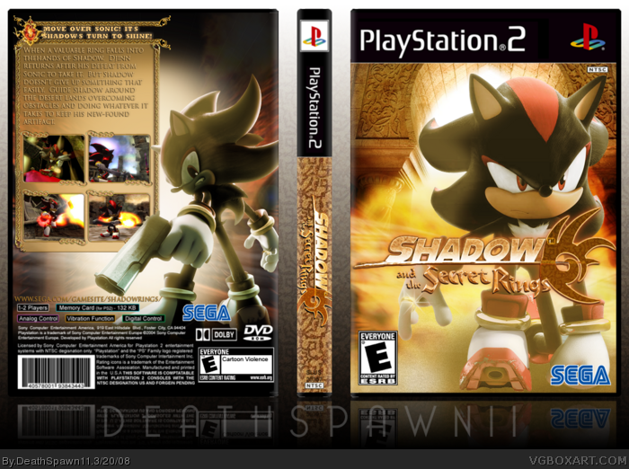
EDIT: on the back there isn't a space between the hands it's nothing big though
you bastard.... i hate you. not because the box is good/bad or anything, but it's the most disgusting idea ever concocted into pixels. I thought you were joking when you said you were making this... but anyway, the box itself is not your best.
#7, Well knowing you, you were likely joking but you have to express yourself in a different way. Some people are going to think you're being serious.
#8, If you're implying it should be rated down a lot because it's not on the Wii, then that's unfair. You can always elaborate on your score. Anyway the design looks great.
Nice one DS11... love all the rings on Shadow on the front --- even better if you had one pieced his ear too! LOL Great edits! ;) Again, I love the spine... I think you make the best spines of any member here IMO! (usually overlooked) ;) And as LadyKiller would say, gun tip is too close to the website link (LOL).. A little empty on the back behind Shadow too... but overall great box! ;)
#21, well heres the problem with that. first, you didn't specify whether you wanted the front or the back. second, the images were heavily edited to create "new artwork" I guess you could say. the front background is just 3 arts (the arch, a part of a street from a Shadow The Hedgehog wallpaper and a fire pic) with a bunch of blending to them. The back is also 2 pieces of art (a wall and the street again) with a white light in the bg. plus the images are kinda small and probably wouldn't help you.
 Shadow and the Secret Rings Box Cover Comments
That's just awesome. *preys that Sega doesn't make this game*
[ Reply ]
Whoa...
[ Reply ]
Heres some tips
I Like it
I love it
It's really cool
5/5
i'm gonna fave it
:P
EDIT: on the back there isn't a space between the hands it's nothing big though
Edited at 1 decade ago
[ Reply ]
had fun with this one, editing everything. credit to Chibi (I think) for the temp.
[ Reply ]
Nice work, i think the back area with the text and screens could be a bit bigger. Nice work.
[ Reply ]
#4, Techne I think, i really like the front, but the back is kinda boring =/
[ Reply ]
you bastard.... i hate you. not because the box is good/bad or anything, but it's the most disgusting idea ever concocted into pixels. I thought you were joking when you said you were making this... but anyway, the box itself is not your best.
[ Reply ]
nice! it probably should have gone on wii, but nonetheless, great one. 3.8/5
#1 lol
Edited at 1 decade ago
[ Reply ]
it's actually better than i'd expected.
nice job ;)
[ Reply ]
#7, Well knowing you, you were likely joking but you have to express yourself in a different way. Some people are going to think you're being serious.
#8, If you're implying it should be rated down a lot because it's not on the Wii, then that's unfair. You can always elaborate on your score. Anyway the design looks great.
[ Reply ]
#10, i was kind of both.
[ Reply ]
looks really good and is put together very well!
[ Reply ]
Nice one DS11... love all the rings on Shadow on the front --- even better if you had one pieced his ear too! LOL Great edits! ;) Again, I love the spine... I think you make the best spines of any member here IMO! (usually overlooked) ;) And as LadyKiller would say, gun tip is too close to the website link (LOL).. A little empty on the back behind Shadow too... but overall great box! ;)
[ Reply ]
Pretty good box
[ Reply ]
OMG
SHUT UP
Too good <rushes to author fav>
[ Reply ]
Cool.5/5
[ Reply ]
You give me the idea to make a silver and the secret rings... I wonder if that would be a good idea..?
Anyway, flawless. Faved
[ Reply ]
this is cool i love it. 1 to go doown in my faves 5/5
[ Reply ]
#13, Haha! Detail is everything, right? :D Also, I should probably change my name to LadyKiller...since that's how everyone spells my name. :P
On the box, that is an amazing piece of work. Great job.
[ Reply ]
Well made as always, DS. :)
[ Reply ]
By the way, could you PM the image you used as the background?
[ Reply ]
this is just awsome.
[ Reply ]
#21, well heres the problem with that. first, you didn't specify whether you wanted the front or the back. second, the images were heavily edited to create "new artwork" I guess you could say. the front background is just 3 arts (the arch, a part of a street from a Shadow The Hedgehog wallpaper and a fire pic) with a bunch of blending to them. The back is also 2 pieces of art (a wall and the street again) with a white light in the bg. plus the images are kinda small and probably wouldn't help you.
EDIT: thanks for another Hall guys =)
Edited at 1 decade ago
[ Reply ]
Nice, love the editing. The only thing is: An E-rated game about a gun-wielding hedgehog in ancient Arabia? *suicide*
[ Reply ]
#24, hehehe, maybe E wasn't the best choice.
=P
Edited at 1 decade ago
[ Reply ]
dat cool. can u tell me how 2 make cool video game boxes
[ Reply ]
That's awesomely creative [not sure about "awesomely]
[ Reply ]
That's pretty tight. Except for the "Guns don't really mix with the Desert" deal.
[ Reply ]
That's cool! No... great!
[ Reply ]
Sweetness
[ Reply ]
#28, that part made me lol. XD;
Looks EXCELLENT. If this was real, I'd buy it just for that boxart. +Fav
[ Reply ]
Oh, BTW, I love that logo sooooo much! It's amazing!
[ Reply ]
#32, thx dude, it was a biatch to edit lol
[ Reply ]
Oh God. x____x Never hath such a good box been made for such a steaming mound of failure.
[ Reply ]
I like how shiney it is 5/5.
[ Reply ]
Great Box. You deserve a 5/5.
[ Reply ]
Dude, this is one of the best box arts i've seen
[ Reply ]
Wow,cool box
[ Reply ]