Perhaps you should give me tips what you think how I could improve my skills rather than just saying it looks silly!
The Sony logo is there because - as you see - there is no place for it on the bottom of the cover. I thought it wasn't that bad placing it there.
Well, Like evklin said, she looks like shes being attacked by the sunlight, here are some tips
the sony is in the wrong place
You really need to get a render where you can put the logo either in the middle or at the top so the sony doesn't have to be at the top. 2/5
#4, I agree, but i do have to say i think your are on to somthing, just update and change a few things like font .. and you need a slogin =]
Not to bad
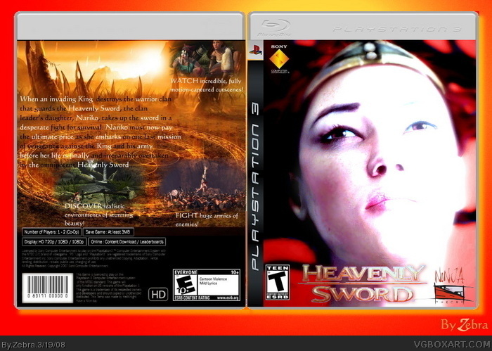
 Heavenly Sword Box Cover Comments
My third box now. Hope you enjoy it.
[ Reply ]
It looks like she's been attacked by sunlight...
The Sony logo is on the wrong place and the front looks silly.
[ Reply ]
Perhaps you should give me tips what you think how I could improve my skills rather than just saying it looks silly!
The Sony logo is there because - as you see - there is no place for it on the bottom of the cover. I thought it wasn't that bad placing it there.
[ Reply ]
Well, Like evklin said, she looks like shes being attacked by the sunlight, here are some tips
the sony is in the wrong place
You really need to get a render where you can put the logo either in the middle or at the top so the sony doesn't have to be at the top. 2/5
[ Reply ]
#4, I agree, but i do have to say i think your are on to somthing, just update and change a few things like font .. and you need a slogin =]
Not to bad
Edited at 1 decade ago
[ Reply ]
Thanks for the advice. I'll see what I can do.
PS: I wanted it to make it look like she's being attacked by light.
[ Reply ]
Isn't that Alex from Half-Life 2?
[ Reply ]