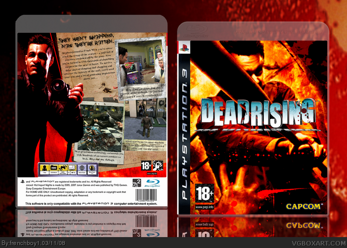
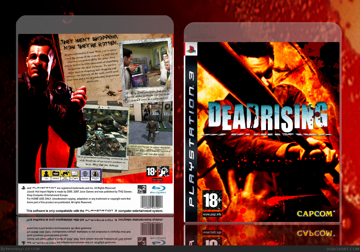
So, here's my duel box against jesse777 and Nerdysimmer. I spent 4 days on it (about 1h30 of work a day, 5-6 hours) and I personally think that this is one of my best work (time to know if I'm true ^^ ). View in full and leave comments (and favs ;) ).
PS : I know, Nerdy, I maybe shouldn't have post this box before the duel, but the deadline is today...
#3, thanks, but I personnally think that it makes the template looks real. Have you ever even seen a real ps3 temp ? =p
#4, Yeah xD some people told me that ^^ Anyway, thanks dude ;)
Not sure about the back tagline ;) And I think the front title logo could be more emphasized..... However.. the rest of the box is excellent. Nice job!
#7, It says "They wen't shopping, now they're rotten." the font I use is kinda Destroy so it make it looks weird ^^ And thanks for the com and the fav ;)
#8, Don't you like the front :( ? I'm joking, thanks ;)
Personally, I think the back is better. The only real problem with the front is with the logo, it should stick out better, it just feels striped, maybe add an outline, drop shadow or glow?
 Dead Rising Box Cover Comments
I think it's freakin' awesome!
[ Reply ]
So, here's my duel box against jesse777 and Nerdysimmer. I spent 4 days on it (about 1h30 of work a day, 5-6 hours) and I personally think that this is one of my best work (time to know if I'm true ^^ ). View in full and leave comments (and favs ;) ).
PS : I know, Nerdy, I maybe shouldn't have post this box before the duel, but the deadline is today...
Edit : #1, quick ! Thanks ;)
Edited at 1 decade ago
[ Reply ]
The temp is a little to transparent but i like the box a lot.
[ Reply ]
Wow, probably your best yet. Looks great, but Frank looks retarded on the back. XD
[ Reply ]
#2, Indeed, that's why i'm in the running team.
[ Reply ]
#3, thanks, but I personnally think that it makes the template looks real. Have you ever even seen a real ps3 temp ? =p
#4, Yeah xD some people told me that ^^ Anyway, thanks dude ;)
[ Reply ]
Not sure about the back tagline ;) And I think the front title logo could be more emphasized..... However.. the rest of the box is excellent. Nice job!
[ Reply ]
I <3 the back. Good job.
[ Reply ]
#7, It says "They wen't shopping, now they're rotten." the font I use is kinda Destroy so it make it looks weird ^^ And thanks for the com and the fav ;)
#8, Don't you like the front :( ? I'm joking, thanks ;)
[ Reply ]
#9, Yeah, but the back is better.
[ Reply ]
Personally, I think the back is better. The only real problem with the front is with the logo, it should stick out better, it just feels striped, maybe add an outline, drop shadow or glow?
[ Reply ]
I think its very nice, although you could've decreased the contrast a bit. Good job, never the less.
[ Reply ]
Thanks guys !
[ Reply ]
4/5 =D
[ Reply ]
Yeah, I'll post the duel now. jesse777 hasn't met up with the deadline.
[ Reply ]
#15, cool =D
[ Reply ]
Well, I added a 3D effect on the logo. Tell me what you think !
[ Reply ]
hmm looks nice good job
[ Reply ]
Almost missed it. Awesome duel box and probably your best yet. Great job, fb1! ;) +fav
[ Reply ]
#19, Thanks =p
PS : Please people, go vote here : link
Edited at 1 decade ago
[ Reply ]