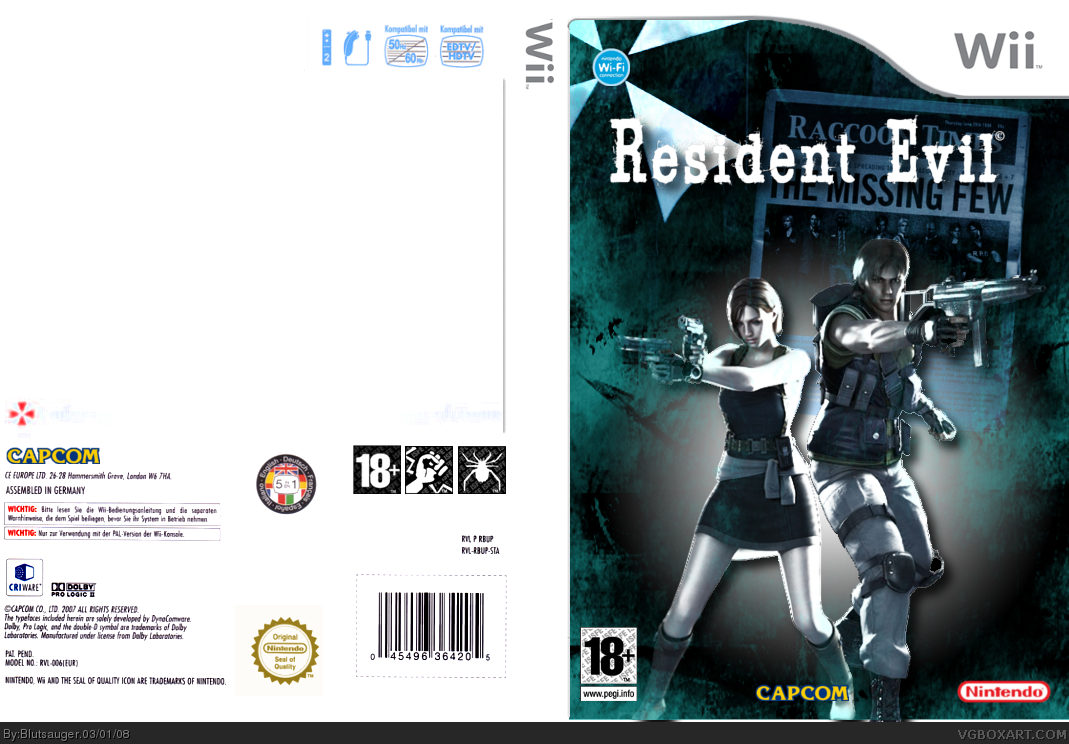
same as the first: white font on white back (parts of the back) are hard to read, "...solutions" to far on the right side of the back. and I`d put the logo in the center (a bit more to the right)
In the near future i put logo more on the left, because theres coming a "3" on the right. Its similar to my other REWii box, cause i will made a serias of boxes with all maingames as an Wii-make with RE4 gameplay.
Its the box of Nemesisisisisis or even "Last Escape"
#4, I don't really get why you submitted it now, you might as well have waited until it was finished before you uploaded it then it probably would've grabbed more people's eyes because the finished thing could be something quite special.
 Resident Evil Wii Box Cover Comments
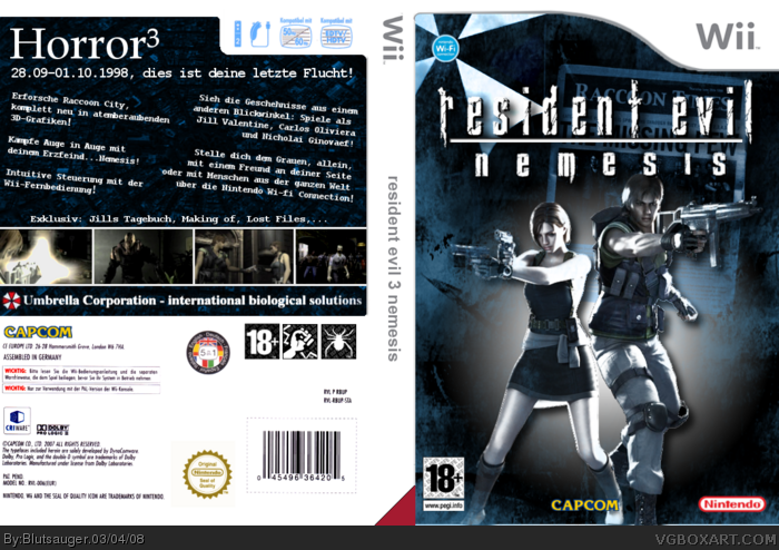
Second Box in the Archive...i´m still working on the back, but the front is almost done...Update comes the next few days^^
[ Reply ]
same as the first: white font on white back (parts of the back) are hard to read, "...solutions" to far on the right side of the back. and I`d put the logo in the center (a bit more to the right)
[ Reply ]
it's pretty good i agree with Wasa-bi. but if the back isn't done don't put it on the main site.
[ Reply ]
im working on that "-.-
In the near future i put logo more on the left, because theres coming a "3" on the right. Its similar to my other REWii box, cause i will made a serias of boxes with all maingames as an Wii-make with RE4 gameplay.
Its the box of Nemesisisisisis or even "Last Escape"
[ Reply ]
#4, I don't really get why you submitted it now, you might as well have waited until it was finished before you uploaded it then it probably would've grabbed more people's eyes because the finished thing could be something quite special.
[ Reply ]
I´ve updated it very fast and i ask you now: Is it something special?
[ Reply ]
Schaut gut aus aber mit den beiden Bildern auf der Rückseite rechts stimmt irgendwas nicht.
Looks good but there is something wrong with two screenshots on the backside.
[ Reply ]
Habs korrigiert, man merkt, das es hier in Deutschland spät ist.
Fixed, i think its to late at night in good old germany, to work prazise...
[ Reply ]
i like how you put the wi-fi logo in the center of the umbrella logo
[ Reply ]
this was not my inrension. It happens randomly...but your right, i like it too^^
[ Reply ]
every thumbnail on the back should have the same size ;)
[ Reply ]
every what?^^ plz again in german..."-.-
[ Reply ]
fixed some mistakes...
[ Reply ]
same as my RE1 and RE0 boxes i have changed the logo...have fun
[ Reply ]
schone! i really like the front. the back isn't bad either. the thumbnail thing you probably know. yea i like it though
[ Reply ]
#12, einklinker, bildausschnitte, ... das letzte (ganz rechts) hat ein anderes format
ansonsten würde ich den abstand von überschrift und untertitel zu dem strich anpassen. so sieht`s aus als würde der zu arg am haupttitel kleben :)
[ Reply ]
so simple but so awsome! heres the link to my re3
[ Reply ]