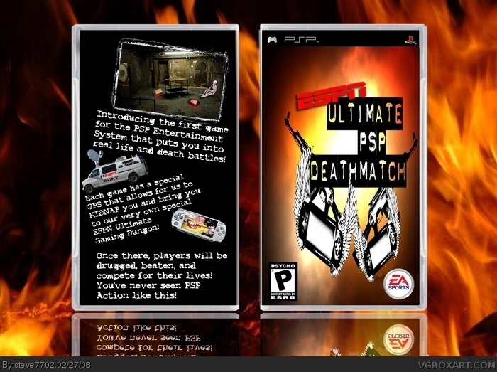
yea i know its stretched. this box is really bad and i made it for the joke. the reason it is stretched is because i made that graphic last year and i didn't keep the original psd, only the jpg so i coudln't make it all proportioned to the psp box. yea just read the back.
i'll even save you the trouble and point out whats wrong with this box:
no back text on game designer or publisher
temp is horrible
pictures: all streched out and terrible
over all 1/5.
why did i submit this you ask? its funny, period.
#4, Wow. I didn't even so much smile after reading it. Not very funny and i don't think just because its a satire that gives you the reason to have a crap box. If i did a satire i would put just as much effort in it as my other boxes and if you wanted it to look nice you could have redone the front and adding something to the back not just black. You didn't even add copyright stuff at the bottom and the glow looks bad.
#9, gee, sorry for having an opinion. i just like the guy's boxes. who cares if there's no effort or the box looks bad? it's a friggin' satire for cryin out loud.
 ESPN Ultimate PSP Deathmatch Box Cover Comments
school project.
[ Reply ]
Dude, you submitted 3 boxes within 5 minutes. This one's the best but it's still pretty bad...stretched pics and stuff. 2.5/5
[ Reply ]
yea i know its stretched. this box is really bad and i made it for the joke. the reason it is stretched is because i made that graphic last year and i didn't keep the original psd, only the jpg so i coudln't make it all proportioned to the psp box. yea just read the back.
i'll even save you the trouble and point out whats wrong with this box:
no back text on game designer or publisher
temp is horrible
pictures: all streched out and terrible
over all 1/5.
why did i submit this you ask? its funny, period.
[ Reply ]
you're like, one of my favourite satire artists here (second to Vekta101). +fav
[ Reply ]
haha thanks vengeance, you're not bad yourself.
[ Reply ]
I don't get the joke, and the images are stretched, and there's no copyright info.
[ Reply ]
#6: read #3.
[ Reply ]
#7, That's not really explaining the joke, which is pretty big in a satire. :|
[ Reply ]
#4, Wow. I didn't even so much smile after reading it. Not very funny and i don't think just because its a satire that gives you the reason to have a crap box. If i did a satire i would put just as much effort in it as my other boxes and if you wanted it to look nice you could have redone the front and adding something to the back not just black. You didn't even add copyright stuff at the bottom and the glow looks bad.
[ Reply ]
awsome!!!!!
[ Reply ]
#9, gee, sorry for having an opinion. i just like the guy's boxes. who cares if there's no effort or the box looks bad? it's a friggin' satire for cryin out loud.
[ Reply ]
i bet if i posted it, vengeance would have never faved it
[ Reply ]
1/5 it has no story it looks lame
[ Reply ]