love this game! love this box! the back is awesome. only thing is you might wanna move the front logo or make it bigger so you can read it better. 4/5 +fav
Actually I prefer your pre-box front because it doesn't hide the title.
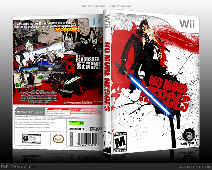
I do like the 3rd screen-shot as it blends in with the black splatter -- maybe you should have done that with the others (or made them bigger, and reverse-splatter them if you know what I mean! LOL
 No More Heroes Box Cover Comments
Finally uploaded.
Special thanks to MARKER for inspiration and help.
Enjoy! =D
[ Reply ]
I like it, but I think you should give the screenshots somekind of borders or effects.
[ Reply ]
thanks
[ Reply ]
ANAKIN!
[ Reply ]
#4, LMAO.
Oh yeah, if anyone wants the 2D version, PM me.
And also this might be my last box for a while.
[ Reply ]
:(
Tell your brother to let you install Photoshop again or you'll take him down with a pair of gardening shears to the jewels.
Hey, it works for me.
[ Reply ]
#6, He did let me install it, and that's why I managed to finish this :D
BTW,
link
Edited at 1 decade ago
[ Reply ]
#7, God, I love you. <3
[ Reply ]
BAD TO THE BONE!
[ Reply ]
#9, LOL thanks
#8, OMGZZZZ YOU R GHEYZZZ!!!!!!one!!!!! IM TELLIN!!!!!
=P
[ Reply ]
love this game! love this box! the back is awesome. only thing is you might wanna move the front logo or make it bigger so you can read it better. 4/5 +fav
Edited at 1 decade ago
[ Reply ]
#11, glad you liked it. (:
[ Reply ]
#12, you dirt, good for nothin' nice-guy! 'Glad you like it!' nahnahnahnahnah! You don't crae... -.- I'm watchin' you, punk!
Btw, I sent you a friend request. Lol, jk.
Btw2, is your avatar Nathan Drake or something?
[ Reply ]
#13, It's that bearded guy from Mercenaries 2. Looks sooo damn cool =P
[ Reply ]
Load of blood... I LIKE IT 5/5 and fave
[ Reply ]
Very creative, i'm not too fond of the screenshot covering the text on the back though.
Edited at 1 decade ago
[ Reply ]
Saw this bad boy in my Fav artist section.
[ Reply ]
BADASS. XD
+fav
[ Reply ]
pwetty thweet
Edited at 1 decade ago
[ Reply ]
Great box m8! Nicely done!
Actually I prefer your pre-box front because it doesn't hide the title.
I do like the 3rd screen-shot as it blends in with the black splatter -- maybe you should have done that with the others (or made them bigger, and reverse-splatter them if you know what I mean! LOL
OH... you forgot the "1" in the Wiimote icon! ;)
[ Reply ]
It's pretty damn stylish but a different set-up for the back might work because the text is micro.
[ Reply ]
Thanks guys (:
When I come home from school, I'll try to fix those problems =D
[ Reply ]
shibang
love the style.
[ Reply ]
My only issue is the small text on the back. Other than that, great job. ^^d
[ Reply ]
thanks guys (:
I will be updating this soon
[ Reply ]
Updated!
[ Reply ]
For anyone who's interested, here is the 2D version:
link
[ Reply ]
I dont understand why this isn't in the hall
[ Reply ]