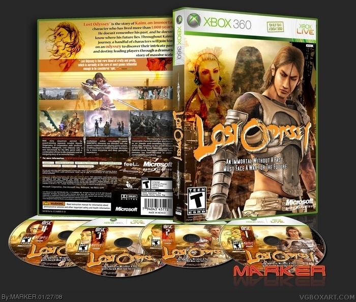
Okay... here's the finished Lost Odyssey cover which was in the forums -- together with match discs... took nearly as long to do those than the cover! LOL ----- Thanks to everyone that commented in myy WIP thread.. you know who you are! ;)
As always... best in full view... or download full size printable version at the usual website (see my page) inc. all disc labels.
Its nice but I feel that you put in "everything but the kitchen sink". Its great that you've rendered so many images and added them so that every nook and cranny of the box has something going on - however it gives the box a very busy look.
I especially think that the screenshot bar and the render of Kaim above the main screenshot was thrown in to fill space.
I kinda agree with #8 as it does have a lot going on... but I think it works in this case. My eyes always have something to float around to and I don't think it's too packed in. Only thing I can see altering would be the amount of text describing each screenshot.
An awesome boxart to an awesome game [just got my first 360 earlier this year to go with my Wii, so my memories of LO are still clear].
I have two [minor and possible major] nitpicks, though:
- Minor; why the screenshot of the final battle?
- Possible Major; I can see the effect you were striving for on the fornt [the back is perfect], but it comes off as alil muddy and too busy [as aforementioned]. I think having just Kaim, Seth and simple[ler] BG may balance it out more and avoid the aforementioned.
 Lost Odyssey Box Cover Comments
This is so cool!
[ Reply ]
Okay... here's the finished Lost Odyssey cover which was in the forums -- together with match discs... took nearly as long to do those than the cover! LOL ----- Thanks to everyone that commented in myy WIP thread.. you know who you are! ;)
As always... best in full view... or download full size printable version at the usual website (see my page) inc. all disc labels.
[ Reply ]
Holy shit....stop making awesome boxes
[ Reply ]
there's no rule against you not being awesome, y'know.
[ Reply ]
awesome, as usual:)
[ Reply ]
Love it, fav+1.
[ Reply ]
great quality and style as always
[ Reply ]
Its nice but I feel that you put in "everything but the kitchen sink". Its great that you've rendered so many images and added them so that every nook and cranny of the box has something going on - however it gives the box a very busy look.
I especially think that the screenshot bar and the render of Kaim above the main screenshot was thrown in to fill space.
Some times its nice to leave some empty space. ;)
[ Reply ]
Very nice work indeed.
I kinda agree with #8 as it does have a lot going on... but I think it works in this case. My eyes always have something to float around to and I don't think it's too packed in. Only thing I can see altering would be the amount of text describing each screenshot.
Keep up the awesome work!
+fav
[ Reply ]
just one more look at this and i couldn't resist faving it.
the discs area fabulous touch!
Edited at 1 decade ago
[ Reply ]
SHAZBOT!! =O
[ Reply ]
Grats on HoF, 4 boxes in a row! A new record! Woo hoo!!
50 boxes in the HoF. o.O
Edited at 1 decade ago
[ Reply ]
An awesome boxart to an awesome game [just got my first 360 earlier this year to go with my Wii, so my memories of LO are still clear].
I have two [minor and possible major] nitpicks, though:
- Minor; why the screenshot of the final battle?
- Possible Major; I can see the effect you were striving for on the fornt [the back is perfect], but it comes off as alil muddy and too busy [as aforementioned]. I think having just Kaim, Seth and simple[ler] BG may balance it out more and avoid the aforementioned.
Just my newbie two cents. Great job yet again!
[ Reply ]