#5 If you know its horrible, why upload it?! Why not just post it in the forums and get advice so you can fix it and then upload it when your happy with how it looks!
well i said it was your best box so far not the best ever, u still should post it in the forums that way people can give u the suggestions then instead of now
#7 But the box IS horrible!!
Its a nice image of Shadow you copied from the internet and then stuck in a template with badly cut logo's stuck over it!!
And the idea of the box is just horrible too!! I mean was you sitting there one day thinking "Hmm i wonder what my next idea for a box could be... Oh wow, i found a picture of Shadow on the internet. I got an idea, i could copy it straight into a box and call it Shadow The Hedgehog. Wow what a great idea for a box."
Okay seriously now! I know my boxes aren't all that great! But at least i try to think of some original ideas for a game.
And another thing Hunter The Hedgehog!
This is your SEVENTH attempt at making a Shadow The Hedgehog box!!
Im not even joking people!! Just look at his past boxes!!
Talk about being stuck for ideas -.-
#9, no, i actually just did that as an idea for a game, and wonderd how a box would turn out, and im past the age of wondering, i guess, if im wrong, oh well for me, at least what you can do is say "oh, this is just a pic of da internet (which it isn't), at least he cut the logos out right"
#11, i agree my past boxes are horrible, but im advancing, and i get pissed at people who friggen criticise my boxes, like that! so what if its my seventh Shth box, its just a box, if you don't like it, don't comment, or even look at anyone of my boxes!
#13 Im not commenting your boxes because i like them! Im doing it because im trying to help ypu!!!
If you make two boxes of the same game on the same platform.... USE THE UPDATE BUTTON!!
#14, i actually forgot about the update button, about 3 weeks ago, poof, its gone! and if your trying to help me, stop commenting like that, i actually would take that as an offence toward my choice of my boxes, thats my style, and thats my ways of making boxarts
#15, alright, im willing to calm down, and apologize, if he's willing to do the same, and at least try and help me with mirroring, thats why this boxart was created, to test my miroring skils
#16 If your way of making boxarts is to continously make the same game over and over again then so be it!! Your choice i guess!!
And yes i am trying to help you! If i didnt care about your boxes, i wouldn't comment at all and just ignore them!
And sometime you've got to be cruel to be kind!
Heres a challenge for ya... for your next box, make it non-Shadow related.
#21, its because i think shadow should have been created 17 years ago instead of that blue fur-fag sonic, sonic is weak, he should of stayed dead in sonic 2006, shadow should of said " ha, the dead fag-bag is gone, lolz, im the new star!"
#23, Shadow is cooler tyhan Sonic (IMO), but Sonic makes more of a main character to the Sonic unless is the dark style that Shadow's game was. That was a cool game, but it doesn't cut out to be an entire series with as amnyt games as Sonic has.
People, people! Let's all just forget about this whole Sonic-Shadow and multiple Shadows boxes arguement. Just leave it open to comments on the box's apearence.
#29 Fine by me! Im through with argueing anyway!
I'll rate the box.
- The Shadow The Hedgehog logo is badly cut and choppy
- The Sonic Team logo should be cut out propely
- The mirrored image should be more transparent
- Its just an image in a template
2/5
anyway, this is perhaps you best hunter. but you need to try to get rid of the pixels around the logo and cut out the sonic team one. this deserves about a 3/5. and Cerium, please tone it down.
#33 Can you maybe not read? Do you require glasses? I just said in a previous comment that my boxes aren't all that great! Try reading yeah?
and #34 & #36
I am sorry. I do get too carried away sometimes. I guess i just like giving my honest opinion and speaking my mind. But in future i will try to tone my comments down. Sorry.
the sonic team logo was ment to be like that, its suposed to be, next-genny like, and i do not know how to make the mirrord box transparent, i said that before, and the shth logo is cut out, just not perfectly, but at least i tried, and i said i would apologize, of cerium did
 Shadow the Hedgehog Box Cover Comments
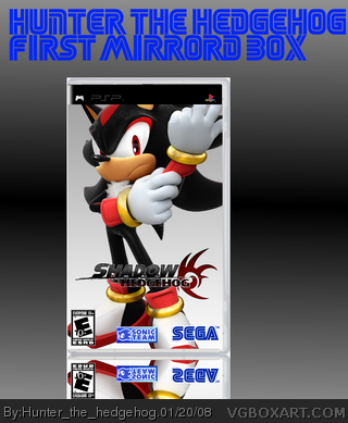
my first attempt at a mirrored box, like da sonic team logo? give me a couple tips how to make the bottem pic a little... y'know
[ Reply ]
k first off cut out sega team logo, maybe add a background and cut out the logo a little better other then that i think this is your best box so far.
[ Reply ]
You moaned at my box for just sticking an image into a template and putting logos on it YET YOU DO EXACTLY THE SAME THING YOURSELF!!!
And is there any need for that awful text at the top of the canvas?
[ Reply ]
#2, that really means a lot to me, my best box eva, a nice resoluion too
[ Reply ]
#3, yes, my first attempt at a mirrord box, and it was horrible, did'nt even make it a litle, mirror like
[ Reply ]
#5 If you know its horrible, why upload it?! Why not just post it in the forums and get advice so you can fix it and then upload it when your happy with how it looks!
[ Reply ]
#6, i said the mirroring was hirrible, not the box, okay?
[ Reply ]
well i said it was your best box so far not the best ever, u still should post it in the forums that way people can give u the suggestions then instead of now
[ Reply ]
#7 But the box IS horrible!!
Its a nice image of Shadow you copied from the internet and then stuck in a template with badly cut logo's stuck over it!!
And the idea of the box is just horrible too!! I mean was you sitting there one day thinking "Hmm i wonder what my next idea for a box could be... Oh wow, i found a picture of Shadow on the internet. I got an idea, i could copy it straight into a box and call it Shadow The Hedgehog. Wow what a great idea for a box."
Okay seriously now! I know my boxes aren't all that great! But at least i try to think of some original ideas for a game.
[ Reply ]
#7, you just got freaking owned
Edited at 1 decade ago
[ Reply ]
And another thing Hunter The Hedgehog!
This is your SEVENTH attempt at making a Shadow The Hedgehog box!!
Im not even joking people!! Just look at his past boxes!!
Talk about being stuck for ideas -.-
[ Reply ]
#9, no, i actually just did that as an idea for a game, and wonderd how a box would turn out, and im past the age of wondering, i guess, if im wrong, oh well for me, at least what you can do is say "oh, this is just a pic of da internet (which it isn't), at least he cut the logos out right"
[ Reply ]
#11, i agree my past boxes are horrible, but im advancing, and i get pissed at people who friggen criticise my boxes, like that! so what if its my seventh Shth box, its just a box, if you don't like it, don't comment, or even look at anyone of my boxes!
[ Reply ]
#13 Im not commenting your boxes because i like them! Im doing it because im trying to help ypu!!!
If you make two boxes of the same game on the same platform.... USE THE UPDATE BUTTON!!
[ Reply ]
All right calm down people please.
[ Reply ]
#14, i actually forgot about the update button, about 3 weeks ago, poof, its gone! and if your trying to help me, stop commenting like that, i actually would take that as an offence toward my choice of my boxes, thats my style, and thats my ways of making boxarts
[ Reply ]
#15, alright, im willing to calm down, and apologize, if he's willing to do the same, and at least try and help me with mirroring, thats why this boxart was created, to test my miroring skils
[ Reply ]
It's a lot better than mine. I kinda' like it actually! Though, it could use a different background than the plain grey-ish one.
[ Reply ]
#16 If your way of making boxarts is to continously make the same game over and over again then so be it!! Your choice i guess!!
And yes i am trying to help you! If i didnt care about your boxes, i wouldn't comment at all and just ignore them!
And sometime you've got to be cruel to be kind!
Heres a challenge for ya... for your next box, make it non-Shadow related.
[ Reply ]
#19, how about... super smash bros box?
[ Reply ]
#20, you should do that. I do have to agree with Cerium, though; you are making a lot of Shadow boxes.
[ Reply ]
#18 I disagree! Your boxes are better than this.
and #17 if your only making boxes to test your mirroring skills, why upload it on the site? What do you think forums are for?
[ Reply ]
#21, its because i think shadow should have been created 17 years ago instead of that blue fur-fag sonic, sonic is weak, he should of stayed dead in sonic 2006, shadow should of said " ha, the dead fag-bag is gone, lolz, im the new star!"
[ Reply ]
#23 you BETTER be joking
[ Reply ]
#24, i wish i were...
[ Reply ]
#23, Shadow is cooler tyhan Sonic (IMO), but Sonic makes more of a main character to the Sonic unless is the dark style that Shadow's game was. That was a cool game, but it doesn't cut out to be an entire series with as amnyt games as Sonic has.
[ Reply ]
Sorry Hunter but i have lost all respect for you after that comment (which has now been deleted by admin THANK GOD)
[ Reply ]
i don't really need respect, (as i don't want any respect, or to give respect)
[ Reply ]
People, people! Let's all just forget about this whole Sonic-Shadow and multiple Shadows boxes arguement. Just leave it open to comments on the box's apearence.
[ Reply ]
Take your fighting to PM's, guys. We don't need this shit here.
[ Reply ]
#30, I agree.
[ Reply ]
#29 Fine by me! Im through with argueing anyway!
I'll rate the box.
- The Shadow The Hedgehog logo is badly cut and choppy
- The Sonic Team logo should be cut out propely
- The mirrored image should be more transparent
- Its just an image in a template
2/5
[ Reply ]
wow cerium u are ridiculous your boxes arent exacly 5/5 and he can make any type of box he desires
[ Reply ]
Cerium, please, do us all a favor and pipe down.
[ Reply ]
#11, shut the freaking hell up. this is better than any other of his boxes and what do you know? YOURE NOT ANY BETTER.
[ Reply ]
anyway, this is perhaps you best hunter. but you need to try to get rid of the pixels around the logo and cut out the sonic team one. this deserves about a 3/5. and Cerium, please tone it down.
[ Reply ]
#33 Can you maybe not read? Do you require glasses? I just said in a previous comment that my boxes aren't all that great! Try reading yeah?
and #34 & #36
I am sorry. I do get too carried away sometimes. I guess i just like giving my honest opinion and speaking my mind. But in future i will try to tone my comments down. Sorry.
[ Reply ]
haha, this reminds me of my old days as arcanus... =\
[ Reply ]
the sonic team logo was ment to be like that, its suposed to be, next-genny like, and i do not know how to make the mirrord box transparent, i said that before, and the shth logo is cut out, just not perfectly, but at least i tried, and i said i would apologize, of cerium did
[ Reply ]