[ Box updated on January 4th, 2008 ] [ original ]
 Sweeney Todd: The Demon Barbor Of Fleet Street Box Cover Comments
Comment on WickedRentheadSuperstaer's Sweeney Todd: The Demon Barbor Of Fleet Street Box Art / Cover.
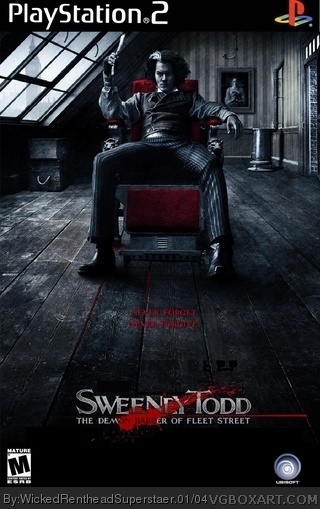
So I saw another box of this so I took a crack at it! I think it's great!
Tell Me what you THINK
EDIT Looks better in full size!
I WANNA SEE THIS!!!!!!!!!!
Edited at 1 decade ago
[ Reply ]
wallpaper
[ Reply ]
#2, I know it looks a lot like that but it's not It's Custome Made I spent weeks on this!
[ Reply ]
ok then its alright. the archway on the bottom seems random.
[ Reply ]
#4, Okay Gimme Tips On How To Make It better! NO INSULTS!
[ Reply ]
#5, that isnt an insult. its good. but the archway i dont like though. the esrb logo is a bit too small. umm i give it a rough 3.5/5
Edited at 1 decade ago
[ Reply ]
and just when we thought he was getting better
[ Reply ]
Nothing blends together, the image quality is grainy, there's a line in the lower quarter of the image where it doesn't line up, it looks like you used MSPaint to black out squares at the bottom and pasted logos onto it.
Weeks? It looks like you slapped it together in a few minutes as a joke.
I recommend getting Photoshop, or GIMP, and learning to smooth things and properly crop.
[ Reply ]
the bottom does look like #8 said. . . lol
[ Reply ]
what is going on with his right foot?!? it looks to be 3/4 cut off....
[ Reply ]
#10, Alright How Do I Make A New Version Of A Box?
[ Reply ]
UPDATED! Fixed it up! So whatcha think
Edited at 1 decade ago
[ Reply ]
YESSSSSSSSSSSSSSSS!!!! now it looks WICKED thanks!!
[ Reply ]
#13, Is That Sarcasim If Not Thanks!
[ Reply ]
#14, it was sarcasm.
[ Reply ]
#15, How Do Ya Know
[ Reply ]
#16, I just do.
[ Reply ]
#17, How?
[ Reply ]
Anyone Else?
[ Reply ]
you should cut out the logo's, make the writing a bit more easier to read. ( does it say never forgive, never porsette?) but its still a decent box, and if you got rid of that totaly random picture on the bottom i think it would like like an official one:)
[ Reply ]
UPDATED! Now what do you think? See Full Size
Edited at 1 decade ago
[ Reply ]
#21, it's getting gradually better and worse at the same time, try and get rid of the black around the logo and it would be perfect oh and make the text clearer
:)
[ Reply ]
#22, The Words Are Better In Full Size!
[ Reply ]
UPDATED Made The Logo Better And If You Look at it in full size the words are perfect! Now what ya think?
[ Reply ]
#24, 4/5 now thats good
[ Reply ]
nope not a bit of sarcasm...you fixed what i thought was wrong...and BOOM it looks great...take a compliment among the sea of sarcasm....
Edited at 1 decade ago
[ Reply ]
#26, Thank you! Anyting else I can do?
[ Reply ]