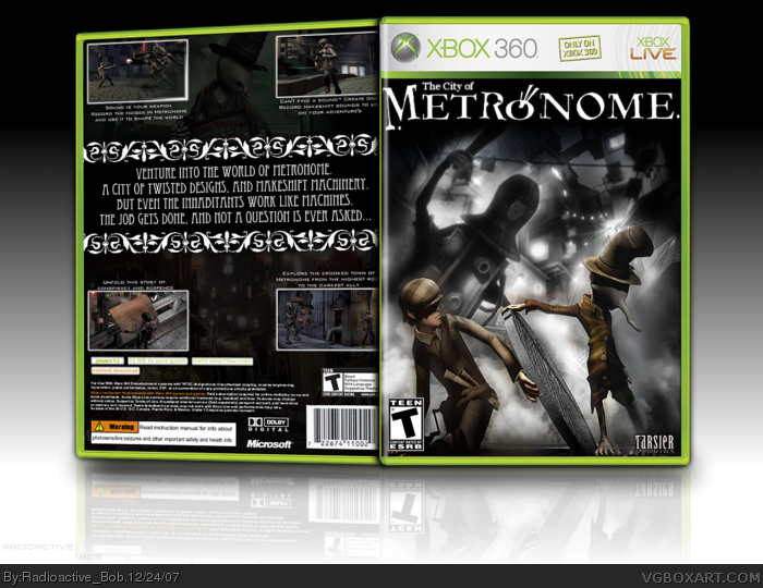
With so little material for this game, i was weary about whether or not i should make this.
But I like the way it turned out.
Feedback would be appreciated. :)
#2-3, thanks guys.
#4, well like I said, the material for this game is barely above nothing. As for the layout and font, i just wanted to try something unique.
 The City Of Metronome Box Cover Comments
With so little material for this game, i was weary about whether or not i should make this.
But I like the way it turned out.
Feedback would be appreciated. :)
Oh, and a merry Christmas Eve to all!
Edited at 1 decade ago
[ Reply ]
incredible.
[ Reply ]
awesome. Nice use of both black and white as well as brown colors. Very distinct feel to it. great job
[ Reply ]
I don't like it, the back seems laking and the part where the text is put looks ugly and doesn't fit the game. Plus, I don't like the font you used.
[ Reply ]
#2-3, thanks guys.
#4, well like I said, the material for this game is barely above nothing. As for the layout and font, i just wanted to try something unique.
[ Reply ]
I have to admit, the front is really awesome. Although I do feel the back is lacking, I think you did a kick-arse job ;)
[ Reply ]
Thanks EL Crazy.
I'll try going back and see if there's anything i can do to the back.
[ Reply ]
really cool, instant fav!
[ Reply ]
Thanks Twilight :)
[ Reply ]
Good, the way the back is angled looks kinda funny though.
also bout time you made another box :p
Edited at 1 decade ago
[ Reply ]
#10, thanks. i tried to give it a bit of depth, so thats why i angled it like that.
haha, ya, i don't have the time like i used to to make box art. :(
[ Reply ]
damn.
[ Reply ]
#12, hahaha xD
Good "damn", i hope?
[ Reply ]
It's wonderful but I'm not a fan of the size of the font you used for the description.
[ Reply ]
Why bother commenting? You know what I'll say.
[ Reply ]