![]() »
»
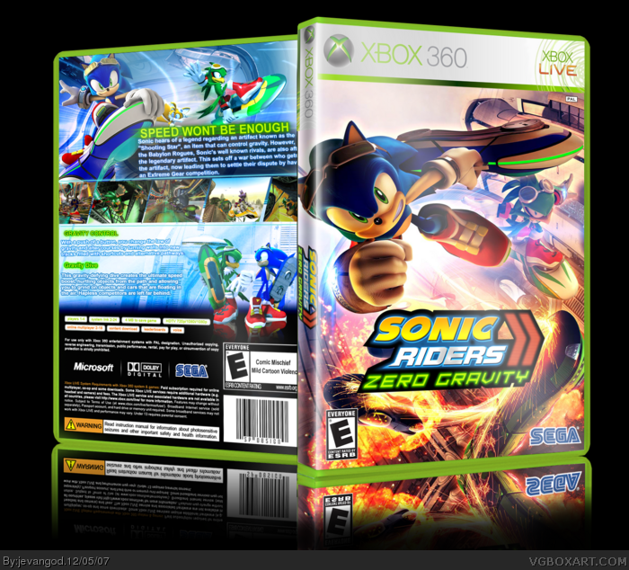
[ Box updated on December 5th, 2007 ] [ original ]
 Sonic Riders Zero Gravity Box Cover Comments
Comment on jevangod's Sonic Riders Zero Gravity Box Art / Cover.
I knew this was your box before I even saw your name. Not a good thing.
[ Reply ]
WEll all my stuff on my computer got deleted including my pictures th other day so I have to get all those pictures back so I decided to make a sonic riders box It took a long time. Temp given to me by Sp6
[ Reply ]
It looks good, infact it looks great. Just one issue. Can you please try doing a new front, something fresh? Ill fav it though Because this is your best one.
[ Reply ]
nice box, i like it
+fav
[ Reply ]
I'm tired of you using this same image, it's become overused. 4/5
[ Reply ]
#5, What other image am I suppose to use for the front
[ Reply ]
The best reiteration of your sonic riders box...kinda lost track what number it is though. 5 or 6? Doesn't matter, this is truly great. I only suggest to have a bigger font for the green text below the screens. Otherwise...really nice :)
[ Reply ]
#6, Umm try making one...I would rather see this as a update than a new post sense there isn't much difference other than the back. Don't get me wrong i like it, but I've seen it a couple times all ready from you.
Edited at 1 decade ago
[ Reply ]
me likey, a lot
[ Reply ]
Well there I changed it after all it is a pal version
[ Reply ]
OMG! It is lovely! 5/5
[ Reply ]
Thanks but I accidently forgot to change the reflection of the game box Ill upgrade it when I get home
[ Reply ]
i think you did great job, the back reminds me my cod4s back:)
Edited at 1 decade ago
[ Reply ]
10000000000000000000000000000000000000000000000000/5 + fav. Well done.
[ Reply ]
#13, YEa that was the point I loved your cod back so I kind of made it sonic riders
[ Reply ]
Upgraded I changed the messed up reflection
[ Reply ]
Oh, you ass! I was gonna use that render on the front. :(
[ Reply ]
#17, Yea that isnt the render it is the poster. But Ive seen the render for it I actually got it saved on my computer and it is nice
[ Reply ]
Phew.
I was just kidding about the "you ass" part... :P
[ Reply ]
#19, Yea I know. I know how much you kid around and stuff if I knew you were really serious like that I would of never gave you my psp temp.
[ Reply ]
Haha, aight. Good.
[ Reply ]
good, but the reflection on the front looks a little messed up.
[ Reply ]
#22, Yea I messed up a bit on that, my bad
[ Reply ]
you improved a LOT
[ Reply ]
#24, YEa I know I actually take my time on the boxes and make sure every detail is right
[ Reply ]
Edited at 1 decade ago
[ Reply ]
way past cool!!!!!!!!!!!!!!!!!!!!!!
10/5
[ Reply ]
#27, Thanks a 10/5 wow I didnt know you thought it was that kewl
[ Reply ]
#28, It shouldn't mean too much coming from that spammer.
[ Reply ]
#29, HE's a spammer??????
Edit: Ohhh now I see he used all the pictures from the official games.
Edited at 1 decade ago
[ Reply ]
Great
[ Reply ]
Congrats Jevan
[ Reply ]
well done, but fix the front bottom, there is something wrong:)
[ Reply ]
#33, SKEW!! SKEWW!! lol.
[ Reply ]
#32, Thanks this is my third hof box
[ Reply ]
IMO, I don't think this deserves HoF. It pretty much looks like the other SR boxes, and there are bad skewing errors.
[ Reply ]
Well other than the fact that it's the same as his others, I don't see much wrong with it. Although the Sega logo looks less 3D.
[ Reply ]
#36, It doesnt really matter what you think it really matter what everyone elses thinks. I dont think they wouldnt fav if they dont like it
[ Reply ]
Yo is there anyone here that I can trust? That I can p.m my contest box to. And they wont send it to anyone cause I need a opinion
Edited at 1 decade ago
[ Reply ]
#36, Someone likes A.C.R.O.N.Y.M.S.
[ Reply ]
#39, ME! you can ALWAYS trust me!
BTW, are you done? That's fast! I JUST finished my logo!
[ Reply ]
#41, Ok I pm'd it to you
[ Reply ]
to be honest I really think this is nothing special, first off I really dislike this template, the quality is awesome and all but that shine on the edge is WAY too strong and it makes it look really weird, and the part on the back with "Microsoft | Dolby | Sega" logos isn't actually on the real things. It's also too tall. The back of the box is really sweet, however, but the art on the front has been raped to death and the SEGA logo looks as if you'd put it on AFTER you'd put the box into Imandix. I'm gonna give this a 3.5/5
[ Reply ]
#43, The template is fine yo this is like one of the best template's on this site
[ Reply ]
I think the temp is 3D to begin with... And Sp-6's temp is AWESOME.
[ Reply ]
Awesome!!!!!!!! How did i miss this?
5/5 +fav
[ Reply ]
although Sonic Rider Zero gravity sucked ass. I do like the box art you made 4/5. Because its Sonic Riders
[ Reply ]
i only see one thing wrong: the front is an image. other than that its good
[ Reply ]
#48, Well thats what pictures are sometimes.
[ Reply ]
wow, this is amazing. I love it. 10,000/5. +fave and +author fave
[ Reply ]
Edited at 1 decade ago
[ Reply ]
nice try but you rotated a wallpaper and slapped a logo on it
dont belive me? link
and about the back...speed is all this game is about really...
[ Reply ]
#52, lol, sonic covers. All I can do is laugh at you. You think they dont know about this. I made this a long time ago and im not the only one that has used that front smartass.
[ Reply ]