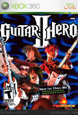
pretty sweet, but i'm not a fan of the background. also the logo looks too close to the edges, and i think you might want to replace the redoctane logo with Activion. Maybe move the characters up some more aswell, because the dude on the bottom right looks kinda squashed.
 Guitar Hero II Box Cover Comments
Edited at 1 decade ago
[ Reply ]
pretty sweet, but i'm not a fan of the background. also the logo looks too close to the edges, and i think you might want to replace the redoctane logo with Activion. Maybe move the characters up some more aswell, because the dude on the bottom right looks kinda squashed.
[ Reply ]
it's not so bad. i like.
[ Reply ]
Edited at 1 decade ago
[ Reply ]
It's awesome for a first :)
[ Reply ]
#5, Thx!
[ Reply ]